Curt’s Special Recipe

http://curtsspecialrecipe.com/

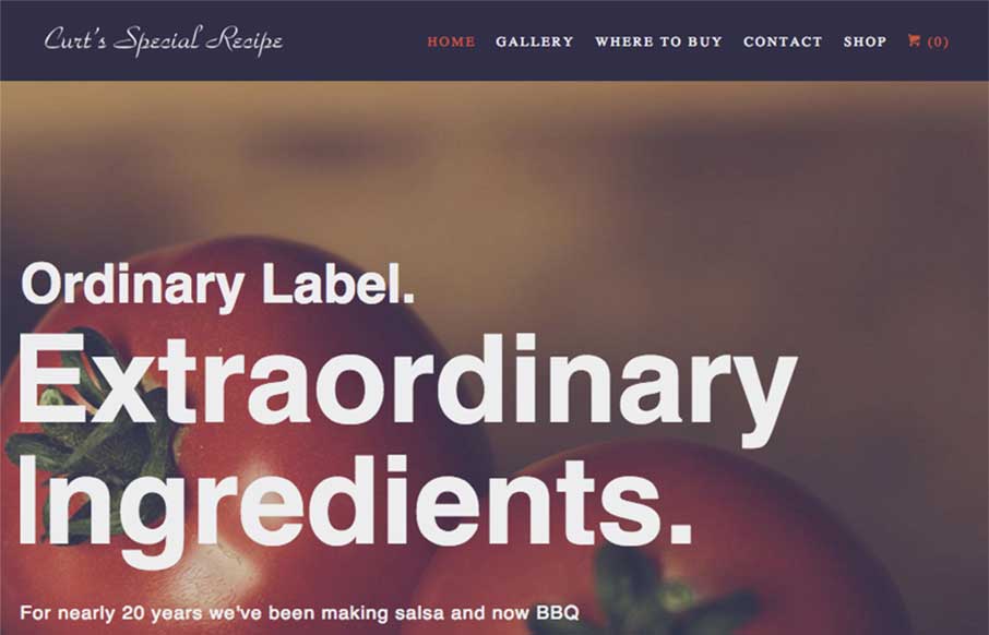
This site is all about the tone for me. Big bold text on the home page set in a simple none fancy sans-serif font. Bold, earthy, homely imagery – love whatever filter they’ve used on these.

The design could have easily gone down a more handcrafted/organic/market stall root – e.g. hand drawn or script fonts (something along the lines of the logo), rough textures etc. But avoiding that gives a better impression of what the sauces taste like – I can imagine big, bold, wholesome, non-fussy flavours. Yum!

0 Comments

Submit a Comment

Your email address will not be published. Required fields are marked *

News & Articles

Sign-Up: Enhancing Conversions through good UX

Sign-Up: Enhancing Conversions through good UX

Optimize your website’s sign-up process by focusing on clarity, ease, and user mindset. Clearly explain the purpose, benefits, and steps, and use social proof to build trust and drive conversions.

The Essential Guide to Getting Started on Freelance Writing

The Essential Guide to Getting Started on Freelance Writing

Explore the lucrative and fulfilling world of freelance writing with our essential guide. Learn about specialties like blogging, social media, article, and technical writing. Build a portfolio, find work, set up your business, and discover the potential earnings. Embrace the freedom of working from home and follow tips for success in your dream career.