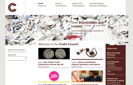
I love the stark graphic nature of this layout, with clean lines and tight boxes make up this website. Overall I like the typography on this website, however using it in the main navigation like this leaves something to be desired. It gets a little washed out and could really stand to be live text instead of the image like it is. I think that would really add to the overall feel of this website and actually complete it. I particularly like the sub pages for the sub sections like this one. It’s really quite nice as you dig through this website which is fairly expansive in content.
Looking Fast: The Art of Website Speed Perception
In the web world, technical speed and user perception matter. By improving design for a faster appearance, you boost conversions and stand out online. Speed isn’t just loading time; it’s perception.


0 Comments