
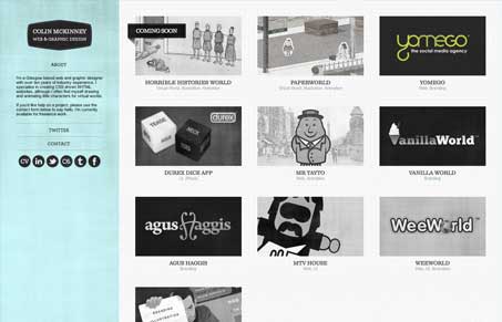
Man I love this website layout/design. I love how the portfolio samples are grayscale then roll over to color, I also love how the navigation/logo area is fixed on the left side like that. These aren’t new things in any respect, but they just look and feel right here in this website. I especially like how the rest of the portfolio samples move and reform the layout around the piece you click on. Very nice touch there. Wonderfully simple great looking website design, and superb work as well.




0 Comments