
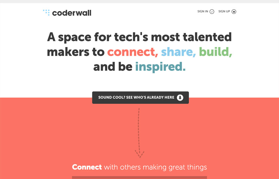
The coderwall website is a pretty simple, single page website. I really dig it because of this simplicity. It does what it needs to do fast, it uses other people in the industry that you already know to show you who’s using it as well as grouping with other brands, so the desire to want to sign-up is baked in visually. This design could easily be responsive but I’m not totally sure that they want you using this on a phone just yet. I haven’t signed up yet, but I will.


Fitts’s Law: Why the Easy Button Wins
Large, close targets are faster to hit than small, distant ones, that’s Fitts’s Law. A look at the 1954 rule behind buttons, prime and magic pixels, thumb zones, and dark patterns.


0 Comments