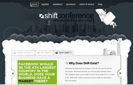
I love the cloud elements in this design and the large header illustration is really nicely done. The swirls really give this a look that’s quite different, and yet subdued at the same time. The rest of the site having that sketchy like quality is also a really nice touch I enjoyed finding. I’m not sure how well the logo/logo-mark really goes with the overall visual style of the website but it’s small and out of the way. Looks like the conference’s content could be promising too.
Update: Pointed out by Sean that this is a theme. http://www.elegantthemes.com/gallery/onthego/ – Design critique still holds, but what a great theme!


Like the design but it is a stock theme from http://www.elegantthemes.com/gallery/onthego/
Sean, man dang it! Thanks for that link man. I really appreciate you guys keeping a sharp eye out for themes, there are so many it’s hard to keep up.