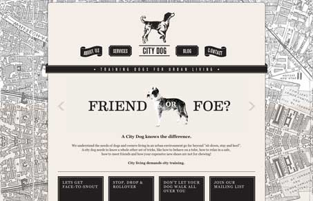
Really cool vibe to this design. The black and white imagery mixed with the old timey map graphic in the background is cool. I like the navigation button designs as well as the large black square marquee items. The site is full of little design details and finish and it really makes for a fun looking website.


I WANT THAT DESIGN!