
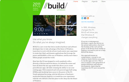
I like a lot of the pieces of this website – for those pieces alone it’s made the gallery here. I like the big green diagonal in the background, that’s dynamic and gives the site some good movement and makes it very visually interesting. The other subtle diagonals in the background are nice too. That same diagonal is echoed in the logo which is kinda cool. The rest of the pages are predictable and the diagonals are pretty much all it has going for it, it’s nice and carries the design enough I think. In the end it’s a good site but pushing it a bit further might make it great.




0 Comments