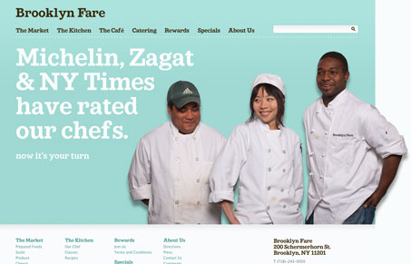
This is a really well designed, friendly site for a market/restaurant in Brooklyn. The colors, type, and photos all go towards their goal of being a friendly, personal part of their neighborhood. I love the typeface, a sort of Clarendon but not Clarendon. Any I do have a couple of issues about behavior and copy and I discuss those in the video review.
Glassmorphism: The Transparent Design Trend That Refuses to Fade
Glassmorphism brings transparency, depth, and light back into modern UI. Learn how this “frosted glass” design trend enhances hierarchy, focus, and atmosphere, plus how to implement it in CSS responsibly.


0 Comments