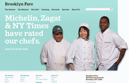
This is a really well designed, friendly site for a market/restaurant in Brooklyn. The colors, type, and photos all go towards their goal of being a friendly, personal part of their neighborhood. I love the typeface, a sort of Clarendon but not Clarendon. Any I do have a couple of issues about behavior and copy and I discuss those in the video review.
Looking Fast: The Art of Website Speed Perception
In the web world, technical speed and user perception matter. By improving design for a faster appearance, you boost conversions and stand out online. Speed isn’t just loading time; it’s perception.


0 Comments