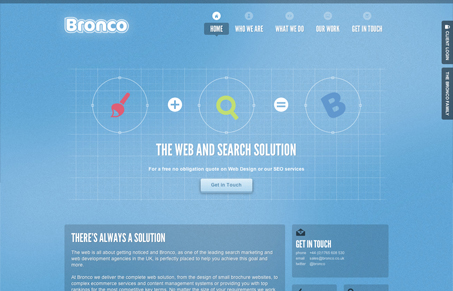
Super great looking website here. I love the heavy use of the icons here, using them to help along their story, very smartly done. Overall the design is rather quiet and solid. The colors are calm and utilize a slight noise/texture to blend it out well. My favorite part is the work page where they’ve boiled down each portfolio piece to a single iconic image.


0 Comments