
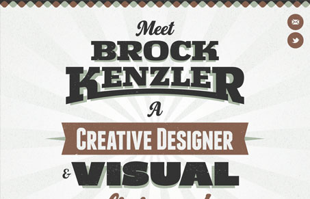
Another super simple single page design but I like this one. I like the oversized type, it’s full of character. I also like the little details, like the rocket ship icon that appears as you scroll down the page to get you back to the top and the texture. It just finishes off a design so nice when you put in the extra love like that – sends a nice message to anyone looking at your work too.




nice and sweet for sure, but i don’t see a lot that distinguishes it from a lot of similar sites. it’s also a site that could scale down pretty easily with only one or two @media breakpoints.
True, a little RWD would be cool to see here.