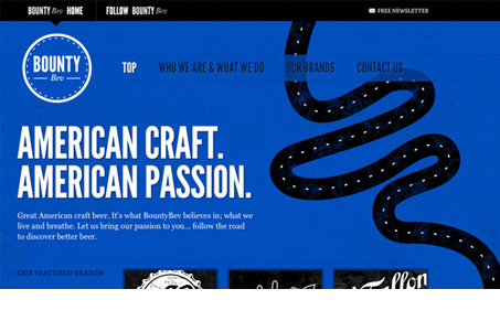
I love the bountybev.com website, nice use of typekit here too. The single page scrolling design is cleverly done with the illustration of the road worked in like it is. It keeps it interesting and has an animated feel even though it’s just a couple of paragraphs of copy.
I really love the “follow” page, the change to orange in the background and the recent tweets looks awesome.


why was this website posted on the main page twice, this is getting tiring. Cool website but once is enough
What do you mean “Lorem”? I can only see where we’ve featured this site once. Are you perhaps thinking of another website?
No no, I am sorry, i don’t mean to be rude, it is just that I am pretty sure I have already seen this website being featured in here! But hey, it is awesome website, love the colors and the nice scroll effect.
No offense taken, and please anyone who visits UMS help keep us honest with posts!