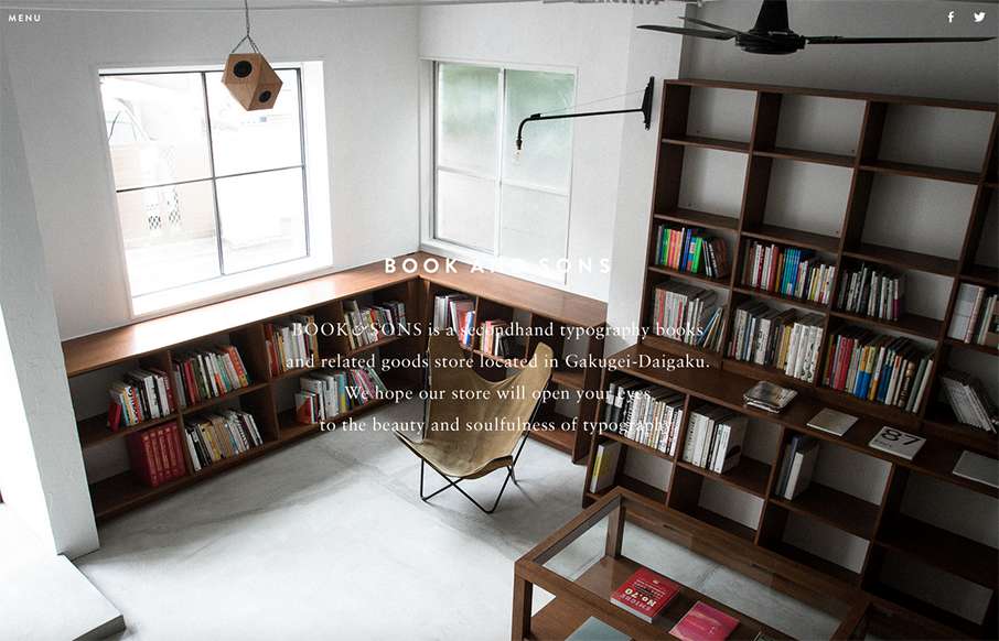
Pretty tidy layout for Book & Sons. I dig the large imagery and the simple nature of the grid at work here. I’m not too happy with the big background images and the white text overlaid on them, sometimes the copy is impossible to read. Fixing that up would leave this site one of the best of the week I think.


Glassmorphism: The Transparent Design Trend That Refuses to Fade
Glassmorphism brings transparency, depth, and light back into modern UI. Learn how this “frosted glass” design trend enhances hierarchy, focus, and atmosphere, plus how to implement it in CSS responsibly.


0 Comments