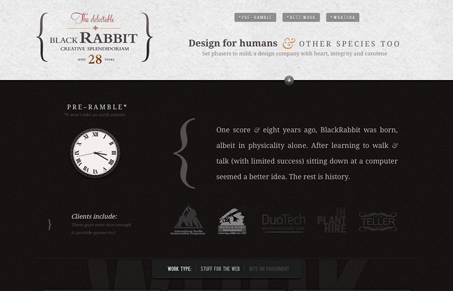
This is one of the coolest uses of the ‘single page’ layout style I’ve seen in a while. It’s a pretty simple use, there’s not a ton of stuff flinging around on the screen, but what’s here is keenly thought out, especially the secret little illustration panel – that’s really sweet.
I like the use of @font-face here, it’s forward and bold for this site design. The typography is great and makes using @font-face look good. The design holds up well as you make your way down the page and I also really like how they’ve displayed the website projects they’ve done. Great work here.


Hi, just found this. Blackrabb.it is my site, thanks for the kind words; appreciated