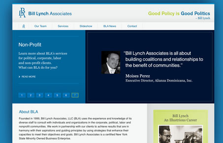
Generally speaking, billlynchassociates.com is fairly pedestrian as a site worthy of designer scrutiny. It doesn’t have a great many bells and whistles (you know, all the jazzy progressive stuff that we all obsess about) but it would be unfair to dismiss a design solely on whether or not it incorporates HTML5 or nifty CSS3 animations. billlynchassociates is still a good design. The structure doesn’t get in the way of the content, though some consideration for more interesting typography would be nice. It feels very much like a template site but with enough diversity of design to be interesting. My favorite page is ‘Slideshow’. Some of the photographs are pretty epic.


Not feeling this one.