Submitted by Bermon Painter, @bermonpainter. Designer & Developer.
Well I ran across the Unmatched Style folks at LessConf and never really realized that you were based in SC. It’s quickly becoming by favorite gallery site so I thought I’d submit my personal portflio.
It’s done in HTML5 with a number of CSS3 goodies. I think it’s purdy.
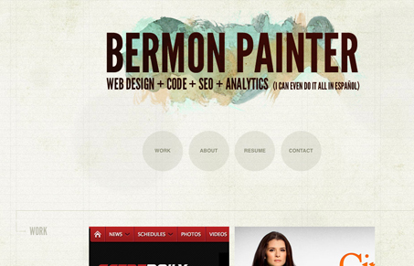
Pretty cool idea to make the site flush right like that. I love the texture work and faint grid lines in the background. The circles in the main nav really make it stand out. It’s also always nice to see someone making @font-face work well for them.
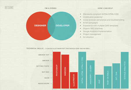
The resume imagery is brilliant, it’s would completely blow me away if it too were created via HTML/CSS instead of being an image, but I totally understand why it’s not – I couldn’t see any real value in doing that other than just being cool. 🙂


Tks for posting my site! I was going to do that image in the bottom as CSS/HTML. This design was a quicky to get up before a Meetup I was going to speak at so I ended up throwing it together in a couple days. The image was unfortunately the path of least resistance.
I’ll have to make that bottom section all HTML now ^_^
Hah, I guess so Bermon. Honestly it’s a great looking site, I just wanted more, more, more… 🙂
At a glance, I thought it’s Jina Bolton’s site.
But I really love the resume imagery. Well done!