
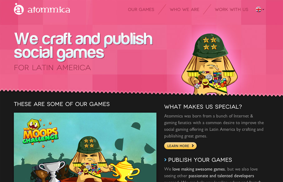
Pretty tight design that allows itself to feel lose at the same time. The illustrations are what helps it achieve that. Simple mouse over animations here and there keep it interesting. Follow all that up with a nice responsive layout and you have yourself a damn fine website.


Fitts’s Law: Why the Easy Button Wins
Large, close targets are faster to hit than small, distant ones, that’s Fitts’s Law. A look at the 1954 rule behind buttons, prime and magic pixels, thumb zones, and dark patterns.


0 Comments