atlason.com

atlasoncom

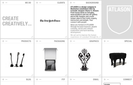
Beautiful design on the surface, I always enjoy experimental layouts & UX like this. The + & – symbols to open and close the blocks is fun. I think you can classify this site as a responsive width design – at least it responds visually to browser screen widths. However in all practicality it’s likely fairly unusable to your average user. Not sure if that matters to these guys or not – It is a fun site to click around on.

0 Comments

Submit a Comment

Your email address will not be published. Required fields are marked *

News & Articles

Looking Fast: The Art of Website Speed Perception

Looking Fast: The Art of Website Speed Perception

In the web world, technical speed and user perception matter. By improving design for a faster appearance, you boost conversions and stand out online. Speed isn’t just loading time; it’s perception.

Designing for Errors: Creating User-Friendly Contingency Plans

Designing for Errors: Creating User-Friendly Contingency Plans

Contingency Design hinges on empathy, understanding user frustration, and transforming errors into positive impressions. By embracing these principles, you enhance user experiences, retain customers, and boost revenue in the competitive digital landscap