
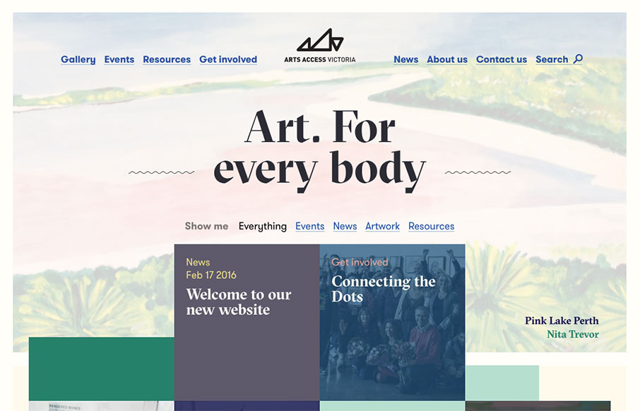
Generally intriguing and thought provoking layout to me. I love the asymmetry inherit in this layout. Balancing out a design with an offset approach like this is difficult but when done well is just beautiful. I think I actually love the simple blue + underlined links for the main navigation the best. I haven’t seen that in a loooong time like this and I love it.


Fitts’s Law: Why the Easy Button Wins
Large, close targets are faster to hit than small, distant ones, that’s Fitts’s Law. A look at the 1954 rule behind buttons, prime and magic pixels, thumb zones, and dark patterns.


0 Comments