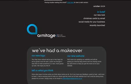
I like the rounded corner boxes with the bottom right being squared off, it’s a nice play off their logo. The dark background is working fairly well on this design too. I like the dark brown and that blue color together. I do wonder if that gave them trouble in some email apps/programs? I could see Gmail eating this alive…
Glassmorphism: The Transparent Design Trend That Refuses to Fade
Glassmorphism brings transparency, depth, and light back into modern UI. Learn how this “frosted glass” design trend enhances hierarchy, focus, and atmosphere, plus how to implement it in CSS responsibly.


0 Comments