Armitage Email

email_armitage

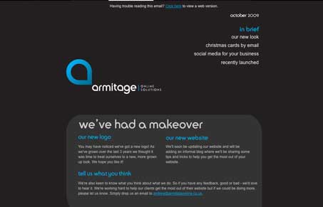
I like the rounded corner boxes with the bottom right being squared off, it’s a nice play off their logo. The dark background is working fairly well on this design too. I like the dark brown and that blue color together. I do wonder if that gave them trouble in some email apps/programs? I could see Gmail eating this alive…


email_armitage

I like the rounded corner boxes with the bottom right being squared off, it’s a nice play off their logo. The dark background is working fairly well on this design too. I like the dark brown and that blue color together. I do wonder if that gave them trouble in some email apps/programs? I could see Gmail eating this alive…

Kinsta

0 Comments

Submit a Comment

Your email address will not be published. Required fields are marked *

Time limit exceeded. Please complete the captcha once again.

News & Articles

The Call to Action, Revisited

The Call to Action, Revisited

The Call to Action hasn’t changed in a decade, but the bar has. A fresh look at prominence, copy, mobile tap targets, and accessibility, with lessons from three major design systems.

Brutalism: The Beauty of Breaking the Rules

Brutalism: The Beauty of Breaking the Rules

Brutalism in web design rejects perfection for authenticity. Stark grids, raw type, and honest structure create interfaces that feel human, intentional, and impossible to ignore. Break the rules, on purpose.
