Submitted by: Gordon Carmichael
@whitespacers / @gordycarmichael
Role: Designer
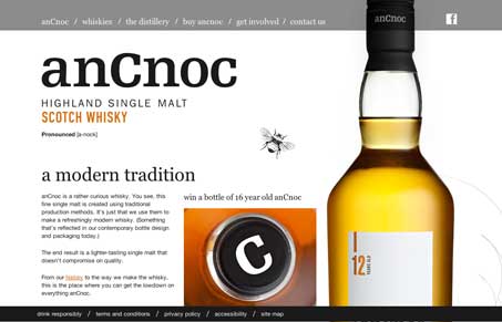
We’ve just completed a new site for anCnoc Single Malt Whisky: http://www.ancnoc.com
You reviewed another one of our sites last year: http://rowtothepole.com/ which we were delighted about. Hopefully you find this one interesting aswell.
We’ve tried to be experimental again, using a single-page approach with lots of large illustrations and product images (including a life-size bottle of whisky!).
Really neat experience when you use this site. It’s a big single page scroller design, but as you use it you see that when hitting the anchors there’s extra images that load on you – nice touch. The scrolling mixed with the large images really is a visually interesting way to explore the site. Love it!


0 Comments