
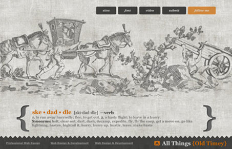
I just love these super looking pencil line illustrations, you can just feel the graphite on it. The ‘old timey’ vibe is also communicated really clearly with this look & feel. WIth a name like that you’ve got to commit and this design does that without being too cheesy.




0 Comments