alexswanson.net

alexswansonnet

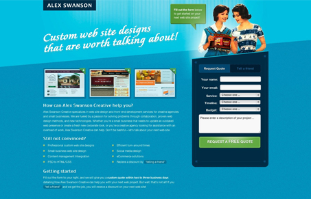
Really cool landing page for Alex Swanson’s main site. I really like the idea of doing a landing page for yourself from time to time and marketing that page. It would be much quicker than re-working your entire site and you can experiment a bit with it.

I like a lot of the jQuery & CSS stuff going on, with the slideshow style effect on the two forms and the animations on the images and link blocks and stuff. I also dig the vibe and colors of the site. Critically though i’m not sure how related the imagery of the women is with the rest of the vibe of the site. It’s cool, i’m just not sure it’s pushed far enough overall to really sell the ‘throwback’ feel for the site. Good job all around on the production and execution of the site.

0 Comments

Submit a Comment

Your email address will not be published. Required fields are marked *

News & Articles

Sign-Up: Enhancing Conversions through good UX

Sign-Up: Enhancing Conversions through good UX

Optimize your website’s sign-up process by focusing on clarity, ease, and user mindset. Clearly explain the purpose, benefits, and steps, and use social proof to build trust and drive conversions.

The Essential Guide to Getting Started on Freelance Writing

The Essential Guide to Getting Started on Freelance Writing

Explore the lucrative and fulfilling world of freelance writing with our essential guide. Learn about specialties like blogging, social media, article, and technical writing. Build a portfolio, find work, set up your business, and discover the potential earnings. Embrace the freedom of working from home and follow tips for success in your dream career.