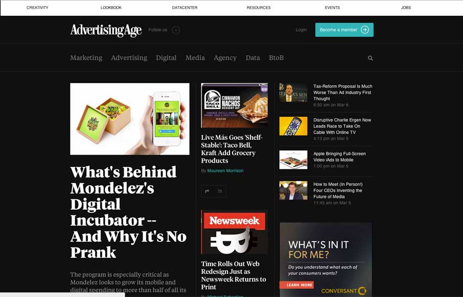
I dig the new Ad Age website. I like the top section that has the black background and how it uses that section for featured content. As you make your way down the page there’s some nice “sectioning” of specific styles of content. I love how the header section changes over from what’s there on initial page load to what you get as you scroll. The logo positioning changes to create more space – even switching to the “AdAge” moniker instead of “AdvertisingAge”. Brilliant.
Looking Fast: The Art of Website Speed Perception
In the web world, technical speed and user perception matter. By improving design for a faster appearance, you boost conversions and stand out online. Speed isn’t just loading time; it’s perception.


0 Comments