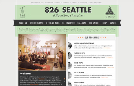
I had a ton of fun surfing around this site. There’s something fun, real, imaginative, and interesting about it. The color palette, textures, and type give it almost a retro feel. On the dev side of things there are nice touches of CSS3 around and a bit of forward-thinking that you don’t usually associate with a nonprofit. There seems to be a lack of hierarchy in the calls-to-action, but it doesn’t bother me as much because everything is still very clear and I don’t mind poking around. The overall feel and presentation is really engaging. Groovy site!
Glassmorphism: The Transparent Design Trend That Refuses to Fade
Glassmorphism brings transparency, depth, and light back into modern UI. Learn how this “frosted glass” design trend enhances hierarchy, focus, and atmosphere, plus how to implement it in CSS responsibly.


0 Comments