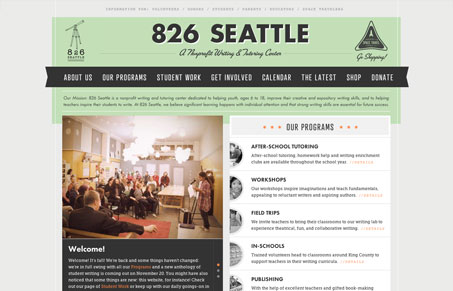
I had a ton of fun surfing around this site. There’s something fun, real, imaginative, and interesting about it. The color palette, textures, and type give it almost a retro feel. On the dev side of things there are nice touches of CSS3 around and a bit of forward-thinking that you don’t usually associate with a nonprofit. There seems to be a lack of hierarchy in the calls-to-action, but it doesn’t bother me as much because everything is still very clear and I don’t mind poking around. The overall feel and presentation is really engaging. Groovy site!


The Call to Action, Revisited
The Call to Action hasn’t changed in a decade, but the bar has. A fresh look at prominence, copy, mobile tap targets, and accessibility, with lessons from three major design systems.


0 Comments