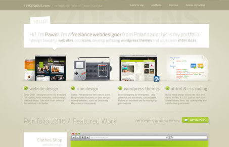
Really cool, single page site. I like the fixed header on this site and the large images of the design samples with the smaller ones worked on top of them like that look really nice. The type is at times a little too thin and difficult to read given the low contrast areas of the design, but the texture is nice. There are also some nice little surprises in the design like the slanted text in the main tagline box and the ‘old school’ icon set is just badass!
Glassmorphism: The Transparent Design Trend That Refuses to Fade
Glassmorphism brings transparency, depth, and light back into modern UI. Learn how this “frosted glass” design trend enhances hierarchy, focus, and atmosphere, plus how to implement it in CSS responsibly.


0 Comments