by Aaron Griswold | Mar 13, 2015 | Gallery, In-Depth Review, Photography, Portfolio
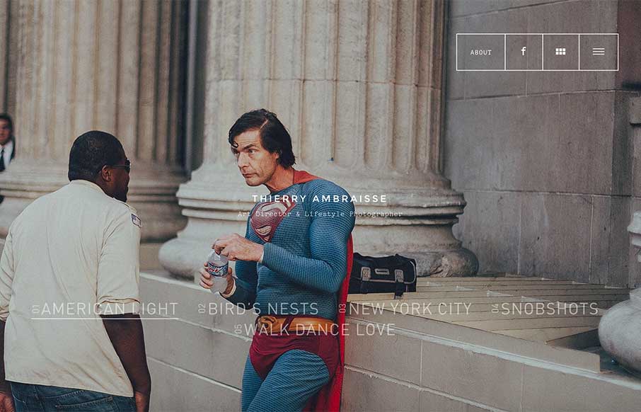
I found this site from a photographer and art director from Paris, Thierry Ambraisse, a little while back – and for some reason didn’t review it. I found it again this week, and something resonated with me, and really paid attention to the photos, the...
by Aaron Griswold | Jan 22, 2015 | Gallery, Photography, Shopping
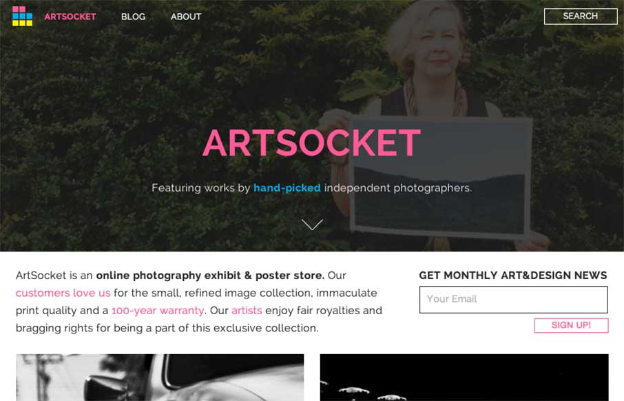
It’s kind of nice when the designer reviews the site for you. It helps when they’re right in their assessment of their work – Dmitri Tcherbadji did that for me here with talking about ArtSocket. From the Designer: “This is a three-year...
by Gene Crawford | Oct 31, 2012 | Gallery, Photography
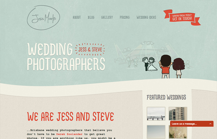
I love these colors, they feel so soft and welcoming and perfect for the subject matter. The little slideshow/animation of the scenes helps you understand really quickly what the site is all about if you don’t notice the large type “wedding...
by Gene Crawford | May 21, 2012 | Gallery, Photography
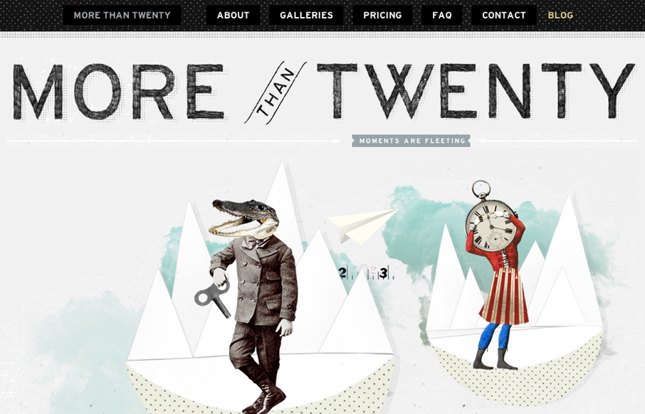
Submitted by: Paul Mosig @r_a_c_k_e_t Role: Designer & Developer Very simple website execution, the fixed header/navigation bar does give it a level of interest interaction wise, as well does the FAQ section. It’s the illustration work that sets this site...
by Gene Crawford | Jan 5, 2012 | Blog, Environment, Gallery, Photography, Travel
Beautiful visual design for this website. I love the colors and simplicity at work here. I love that I can use the arrow keys to check out the photos too! I have to admit the infinite vertical scrolling on the site drives me nuts the way it’s used here. Outside...
by Maria | Dec 21, 2011 | Gallery, Photography
Slick. There’s a high-def feel to this site that makes it feel so sexy. In the world of selling consumer electronics and such, that’s a pretty important presence to convey. Beyond the polished UI, the layout is easily scannable and content nicely...