by Gene Crawford | Jan 28, 2025 | Gallery, Portfolio, Screencast Review
by Gene Crawford | Jan 27, 2025 | Gallery, Portfolio
by Gene Crawford | Jan 24, 2025 | Gallery, Portfolio
by Gene Crawford | Jan 23, 2025 | Gallery, Portfolio
by Gene Crawford | Jan 22, 2025 | Design Firm, Gallery
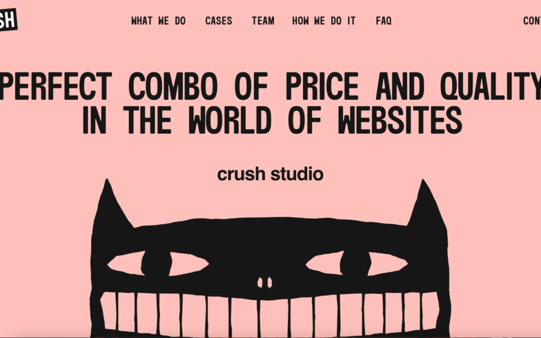
It’s rare you get a website that mixes tone both visually and personally. The Crush website does this extremely well. I just want to meet these people after checking out their website. They look like fun.
by Gene Crawford | Jan 21, 2025 | Education, Gallery, Portfolio
I love the simple approach visually, but the detail work and not to mention the content push this waaaay over the top in quality. Superb work!