by Gene Crawford | Jul 16, 2012 | Gallery
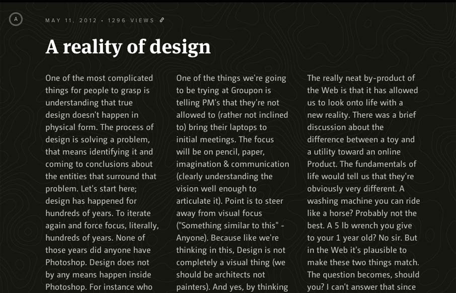
What a beautifully designed experience here. I love the approach of something kind of unstructured yet totally integrated like this. The page jumps right into copy then plops you into some very swell looking info-graphic like sections. You gotta check ’em out as...

by Gene Crawford | Jul 16, 2012 | Gallery
Very thoroughly designed experience on this website design. I really dig how it’s consistent and clean yet feels fresh on each page. The layout is just enough different on each page to keep you engaged with the content. Perhaps it’s the header that...
by Gene Crawford | Jul 16, 2012 | Conference, Gallery
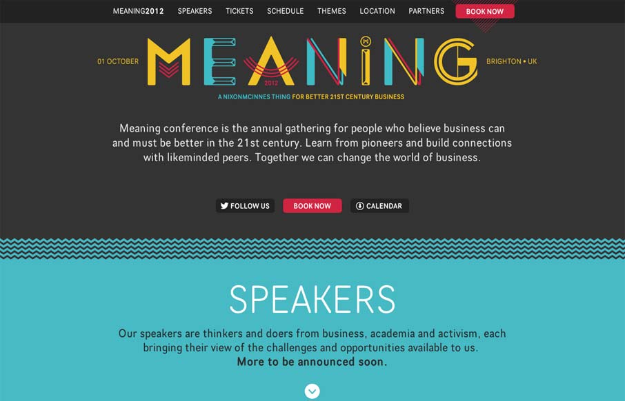
Nice clean conference website design. I like the mix of the green and dark grey. The “book now” button is very clearly/obvious by being red and they also designed that little triangle pattern behind it. The sections are clearly marked with wavy lines and...
by Gene Crawford | Jul 12, 2012 | Design Firm, Gallery
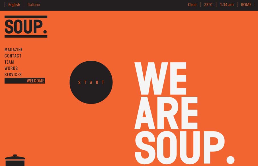
Pretty cool work with such stark colors and imagery. I really like the heavy graphic feel to this layout, it’s an underutilized style these days IMHO. It’s bold and also slick with it’s build out. I dig how when you initially load the site it scrolls...
by Gene Crawford | Jul 12, 2012 | Gallery
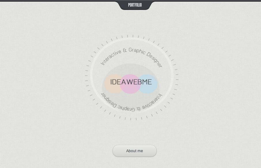
Submitted by: Vasudha Chandak @ideawebme Role: Designer & Developer Damn! This is just cool. I love the minimal design look but rich interaction model so much here. The way you go from section to section feels really seamless and is fun to experience the...
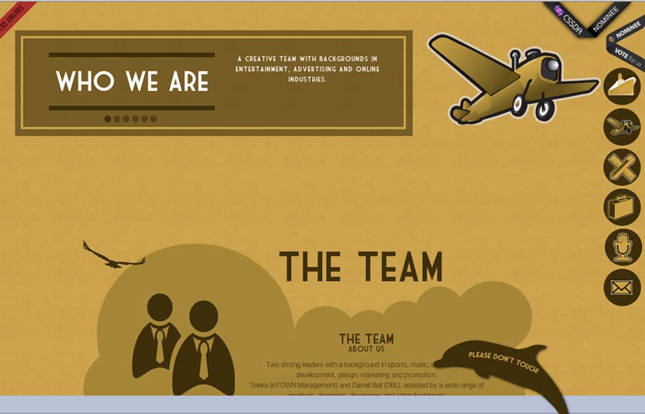
by Gene Crawford | Jul 12, 2012 | Gallery
Submitted by: Tineke Timmerman @inTOWN_NL Role: Designer & Developer Pretty cool interaction on the footer. The “please do not touch” dolphin got me. I touched it… Overall I really like the type and the illustration fo the boat. It’s like...
