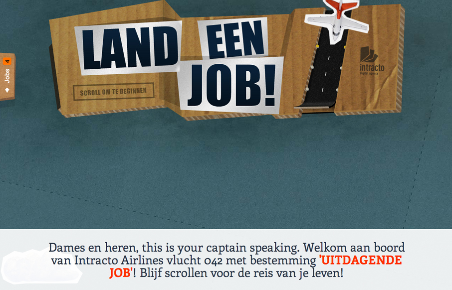
by Gene Crawford | Aug 14, 2012 | Gallery
Submitted by: Maarten De Proost @intracto Role: Designer A one-page scrolling site created for a recruitment campaign for Belgian digital agency Intracto. The ‘airlines’ theme came from the term ‘landing page’, which it actually is. Hence the title of the campaign...
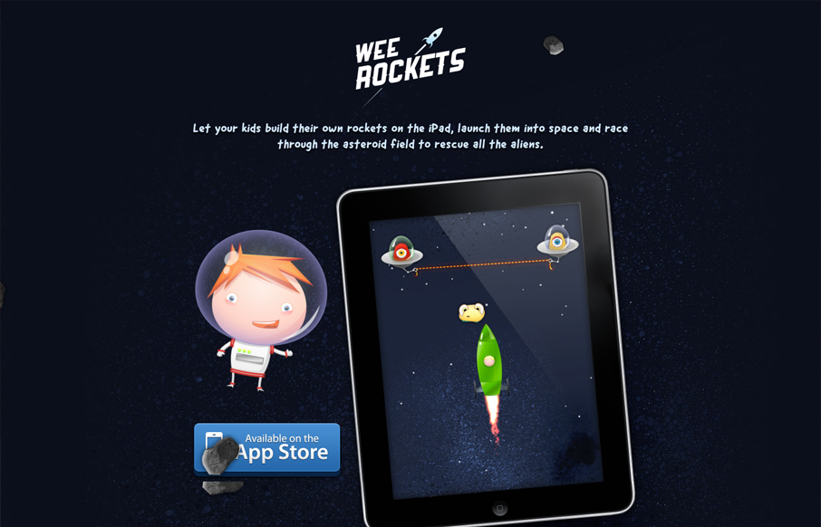
by Giovanni DiFeterici | Aug 14, 2012 | Gallery, Gaming
Submitted by: Paddy Donnelly @paddydonnelly Role: Designer Let your kids build their own rockets on the iPad, launch them into space and race through the asteroid field to rescue all the aliens. Holy frijoles, that is adorable! I love the art and the subtle...
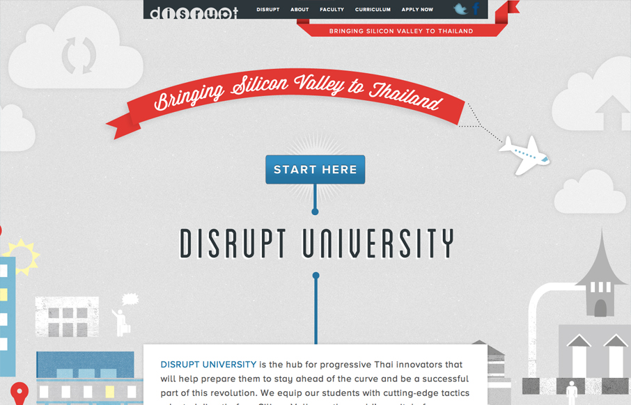
by Gene Crawford | Aug 14, 2012 | Gallery
Submitted by: Matthew Seccafien @studiocartogram Role: Designer & Developer Disrupt MBA is a four week accelerated transformative experiential learning program. In just one month they expedite you from your creative idea to your innovative start up, and give you...
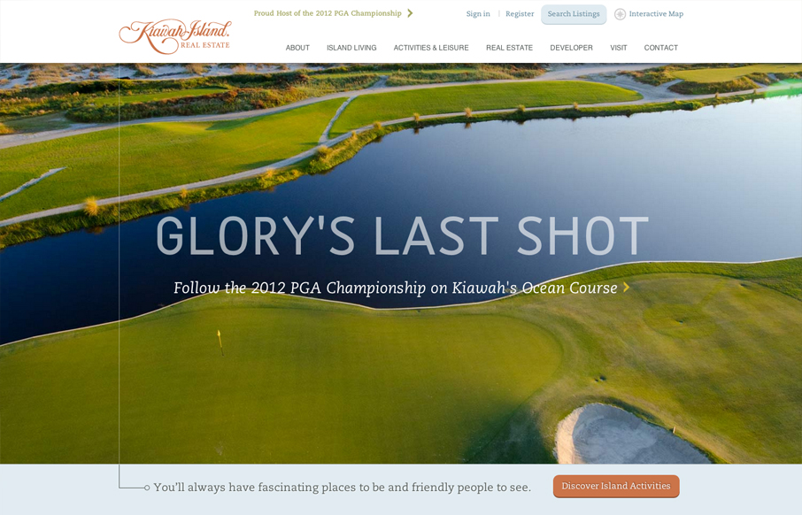
by Gene Crawford | Aug 13, 2012 | Gallery, Travel
Another great website from the fine folks at e house studio with kiawahisland.com. My favorite part is how the nav is fixed until you get a to a certain target point in the page, then folds up into the top of the page. I also like the change from rectangular imagery...
by Gene Crawford | Aug 13, 2012 | Gallery
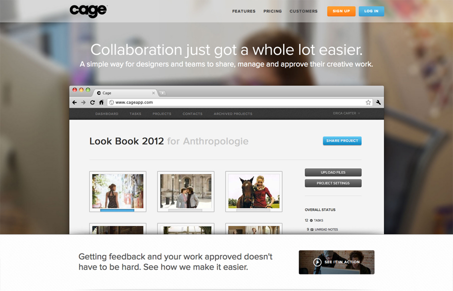
Name: Sandip Patel @cageapp Role: Designer & Developer Cage is an online collaboration tool that provides a secure environment for creative teams in web, mobile, print, video, design, 3D and motion graphics to easily present their work for feedback and approval....
by Gene Crawford | Aug 13, 2012 | Gallery
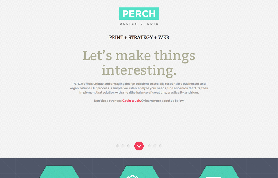
Name: Stacy Kim @perchmade Role: Designer & Developer Although this website is fairly complete—we really consider this a one page splash page—a precursor to the full website. The design is simple and focuses on color and typography. This may be just a one page...