by Gene Crawford | Oct 15, 2012 | Blog, Gallery
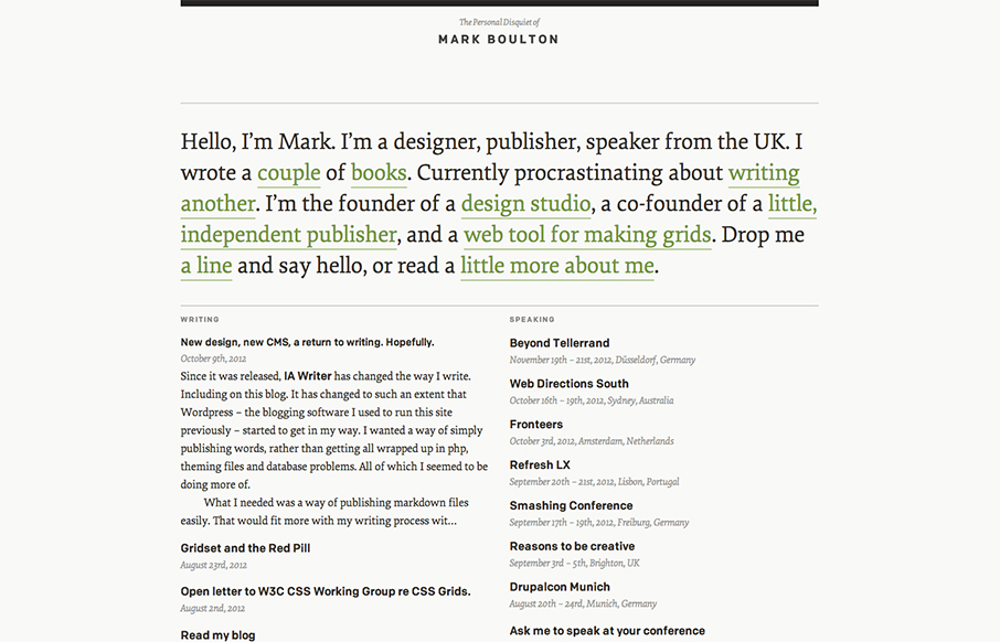
I’ve watched Mark Boulton’s blog/site designs over the years make this really refreshing trip towards being completely minimal. I love it. He’s gotten down the just the bare essence of what he needs in a website, particularly with this latest design...
by Gene Crawford | Oct 12, 2012 | Gallery
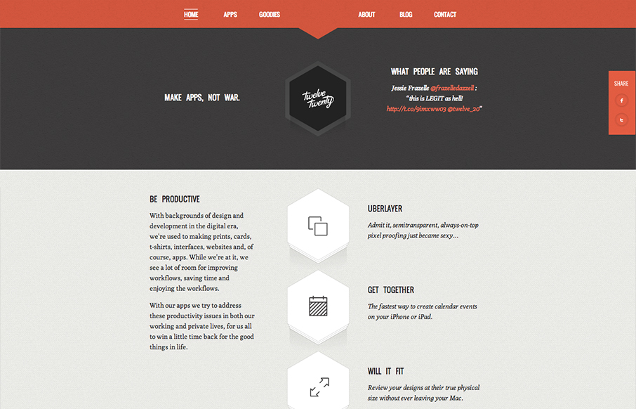
Really tightly designed website for Twelve Twenty. The little interactions that happen when you mouse over the icons are nice and keep you interested. The overall sharpness and minimal approach of the design mixed with limited color palette make it kind of stick...
by Gene Crawford | Oct 12, 2012 | Entertainment, Gallery
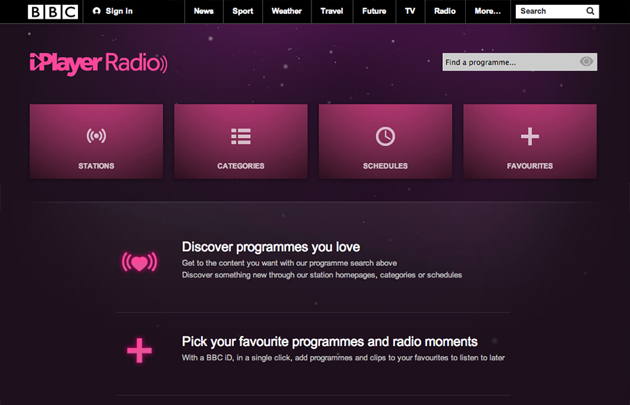
Well, well, well: looks like the BBC Radio site’s just launched a fine-lookin’ responsive site. bbc.co.uk/radio/ /via @paulrobertlloyd— Responsive Design (@RWD) October 8, 2012 While this isn’t a typical “website” it’s still worthy of...
by Gene Crawford | Oct 11, 2012 | Gallery
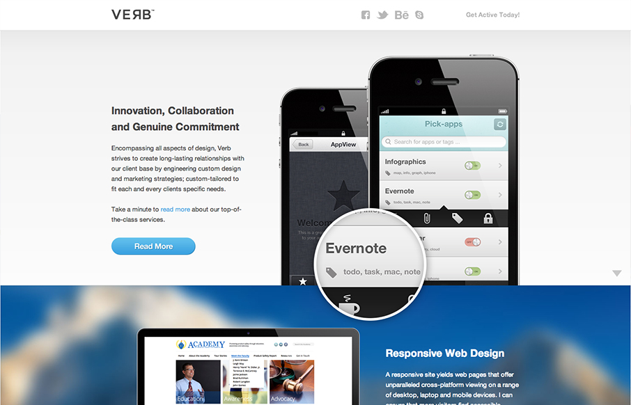
Submitted by: Alex Deeley @aedeleey Role: Designer & Developer At first I thought the design was for a product, then read the copy and saw it was for a web design firm. I can dig that. Overall it’s a dang fine looking site and I like the slight parallax...
by Gene Crawford | Oct 11, 2012 | Entertainment, Gallery
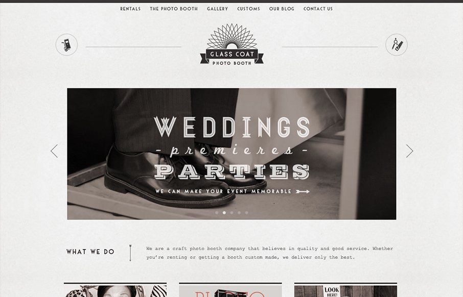
Really digging the style of this site, combined with the fun animations and pics glasscoatphotobooth.com — Dan Denney (@dandenney) October 1, 2012 Nice clean design with a striking monochromatic “grey” color scheme. It’s nice when you check out the...
by Gene Crawford | Oct 11, 2012 | Blog, Gallery
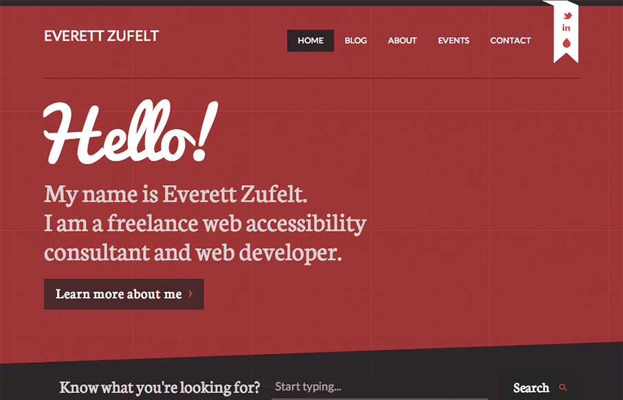
The red and black design always works IMHO. Mixed with a nice grid and a diagonal it just comes off as smart. I like the subtle grid pattern that can be seen behind the design and the type mix works well with the grid vibe. I like that search form design a lot. Great...
