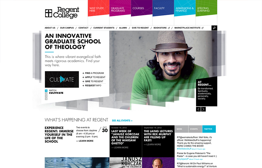
by Gene Crawford | Oct 22, 2012 | Education, Gallery
The navigation design for Regent College is quite interesting. The multi-colors and angles make it visually dynamic. Then there’s a strong drop-down design too. Good responsive execution to boot makes it a pretty dang nice design overall to check out.

by Giovanni DiFeterici | Oct 22, 2012 | Gallery
Basically a “splash page” to house links off to the EP and 12″ or download stuff. But it’s wonderful and sets a nice visual for the music. It’s like doing a cover song, if you’re going to cover it make it your own or better....

by Gene Crawford | Oct 19, 2012 | Education, Gallery, Music
By SimpleFocus out of Memphis TN. Beautiful website design for the Memphis Music Hall of Fame by the fine team at Simple Focus. I really love the interactions on the images, it let’s people know right away by way of visual feedback what’s an active link....
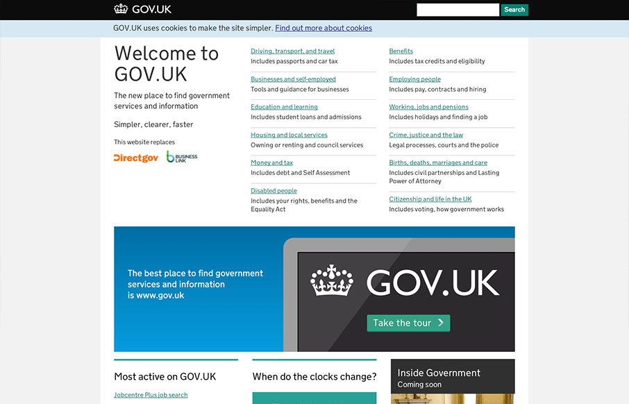
by Gene Crawford | Oct 19, 2012 | Gallery, Government
I absolutely love this design. I’ve tried to accomplish a design like this myself (a site that’s largely a big set of text links) and have fought opposition from management from the client and lost. Makes me very excited to see a solution like this for a...
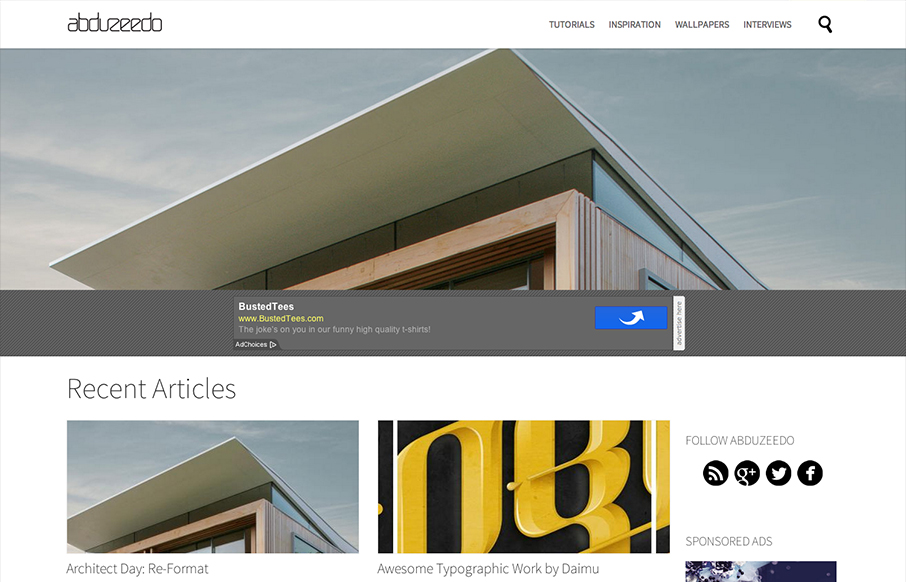
by Gene Crawford | Oct 18, 2012 | Blog, Gallery
An evolving project. Note about the design from their blogpost. Abduzeedo will always be a work in progress. It’s in our DNA, we need to change and we want to change. We love to design things and with the blog we have freedom to try. We might fail, but the only...
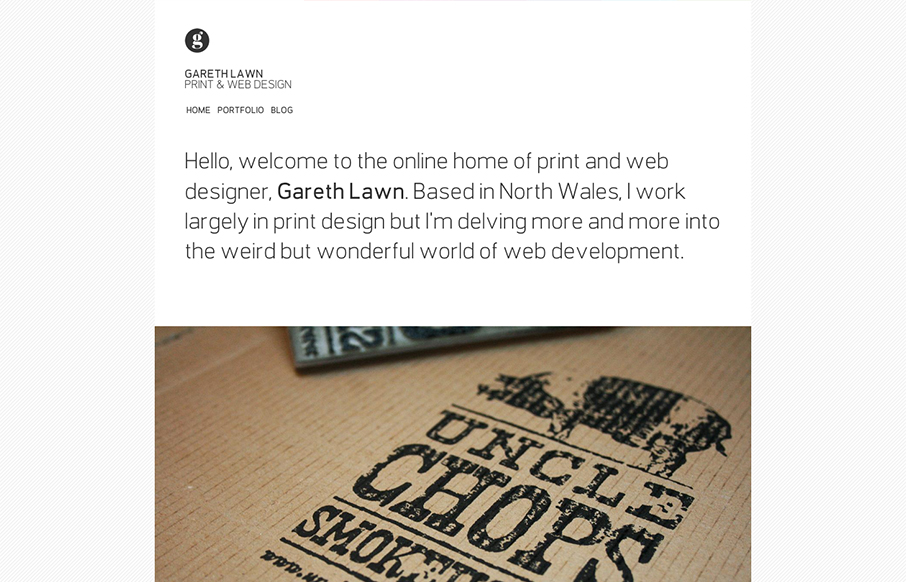
by Gene Crawford | Oct 18, 2012 | Design Firm, Gallery
I like the minimal design for Gareth Lawn’s website. Putting the type front and center with a big central image. Nicely designed responsive solution too.