by Gene Crawford | Dec 17, 2012 | Design Firm, Gallery
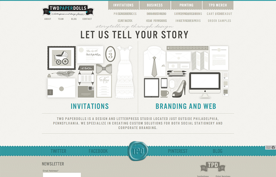
Gawd I love these illustrations, so precise and fun. The second thing is I like how upfront the two directions in service are displayed. “Invitations” and then “Branding & web” you can choose your adventure. That’s smart if the...
by Gene Crawford | Dec 13, 2012 | Gallery
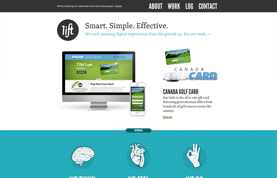
Hands down a superbly designed and executed website for Lift Interactive. It’s full of some really great interaction design that also doubles as a super simple layout too built up with solid illustration work. It’s layered, that’s what i’m...
by Gene Crawford | Dec 13, 2012 | Gallery, Software
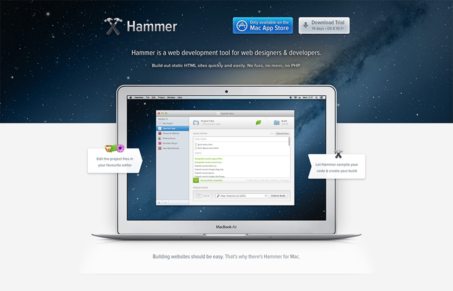
Beautiful website for Hammer. I love the airy-ness of the way the content is designed and balanced with colors. The slideshow (not sure that’s quite the name for it) is masterful. I love the zoom in to see the detail of the screens and the interactions overall...
by Gene Crawford | Dec 13, 2012 | Gallery
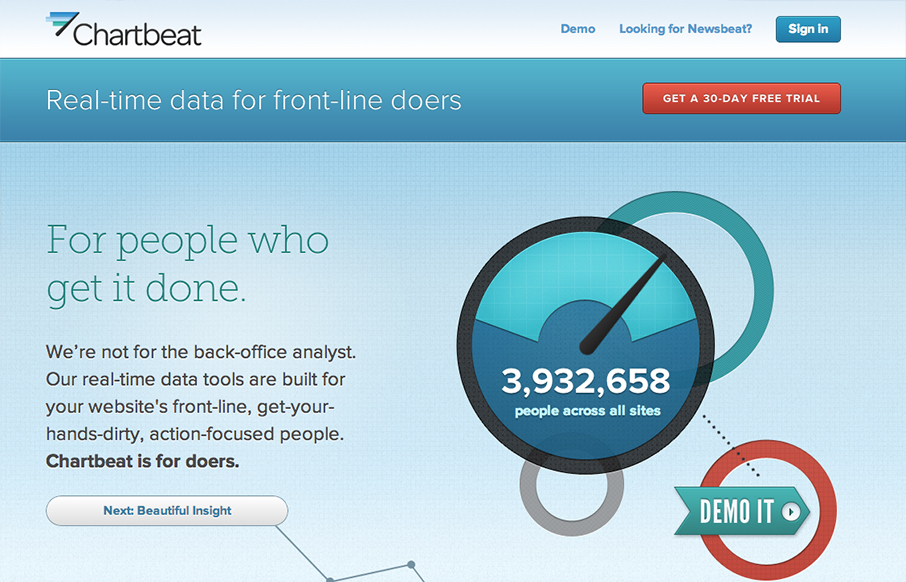
I really love this narrative as you scroll home page for Chartbeat. It just sings to me. You can essentially get acclimated to what the product does for you as you make your way through the page. It’s also superbly executed. It’s exciting visually. This is...

by Gene Crawford | Dec 12, 2012 | Gallery
I can’t believe we didn’t review the 2012 Beercamp site so far this year. This site will not escape the gallery here on UMS. It’s a friggin’ pop-up book for crying out loud. Just marvel at it’s awesomeness and enjoy. Also, Monsters!

by Gene Crawford | Dec 12, 2012 | Gallery
Nice clean and sleek looking new design for the Skype website. It’s responsive too which is super smart for them to not miss this type of user since Skype is not available on most mobile platforms. I love the big call to action in green almost in the center of...
