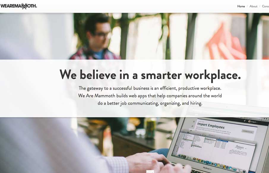
by Giovanni DiFeterici | Feb 26, 2014 | Gallery
The We Are Mammoth website is a simple site that feels tight and focused in content, clear in message and definitive in style. Not much more to say. Good stuff.
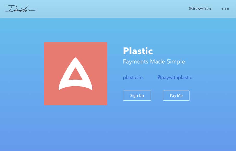
by Gene Crawford | Feb 25, 2014 | Gallery, Portfolio
Drew Wilson’s portfolio site is a delightful experience. From the first few examples of products down to just digging through his project timeline it’s smart and easy to take in. Well done sir.
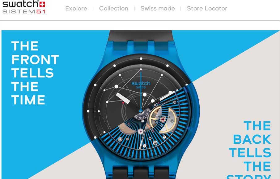
by Gene Crawford | Feb 25, 2014 | Gallery
Fun product page for the Swatch SI System Watch. It makes strong use of timed animated images of the watches, letting you get a sense of their tactile quality as you scroll. I also dig the map, click on a store location to see the way the map responds. It’s...

by Giovanni DiFeterici | Feb 25, 2014 | Gallery
Beoplay’s H3 site site is truly beautiful. I’m often against the practice of hijacking the user’s ability to scroll, but the effect works really well on this site. Every ‘page’ is clean and minimal, but provides a very different user...
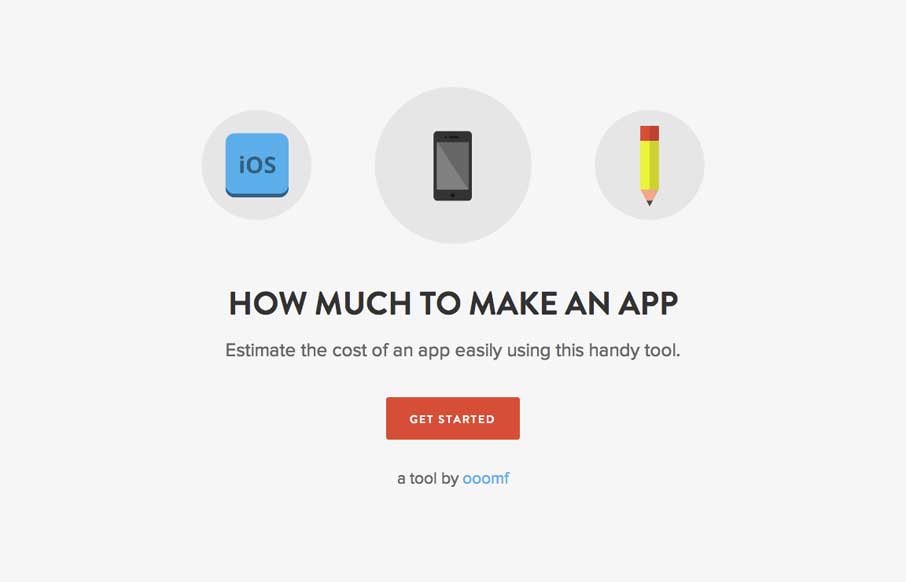
by Gene Crawford | Feb 24, 2014 | Gallery
This site/app is so dang simple it hurts. It’s beautifully done, you could use it to send to a prospect so they understand pricing across the industry. The icon work is great, coloring is great and there’s no barrier to use – you just answer...
by Gene Crawford | Feb 24, 2014 | Gallery
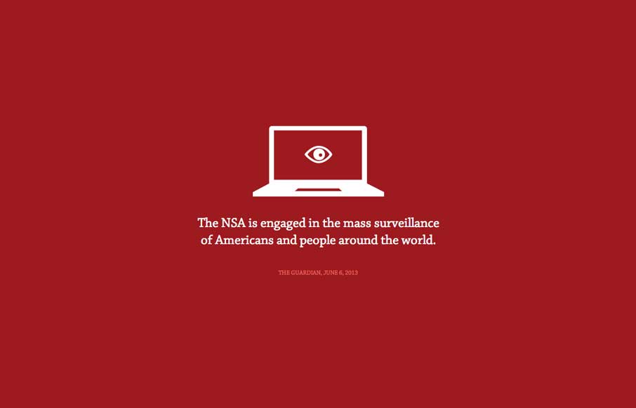
The Now Way NSA page is largely a big infographic/news piece. It’s worth a look through other than to review the design of it, but the design of it is great. Now go and get enraged at the NSA.