
by Gene Crawford | May 2, 2014 | Gallery, Travel
Oooh, what a nice site to check out. I luuurve the illustrations and how they’re used to tell a story. Beautiful stuff.

by Gene Crawford | May 1, 2014 | Gallery
Beautiful and simple approach to this site’s layout. Cool use of the Masonry like layout below the hero image area too – actually putting it to work via the content too.

by Gene Crawford | May 1, 2014 | Gallery
Cool vibe to this site. I like using it. The use of the “hamburger” icon to show the names of the pages/sections instead of only relying on the icons is a good idea. I love the yellow and black with the B&W imagery to boot.

by Gene Crawford | May 1, 2014 | Education, Gallery
Pretty cool visual details built into this site. Like the sped up video in the hero area and all the loading animations as you scroll down. Really great visuals to boot. Winning combo design wise.
by Gene Crawford | Apr 30, 2014 | Gallery
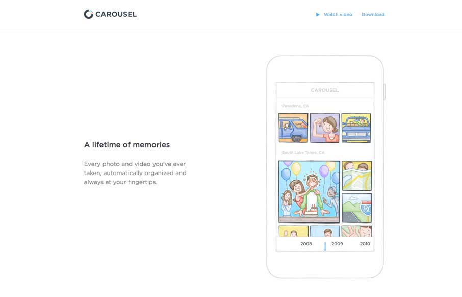
Nifty one pager for the Carousel app from Dropbox. Just kinda tells the story and that’s all it needs to do.
by Gene Crawford | Apr 30, 2014 | Entertainment, Gallery
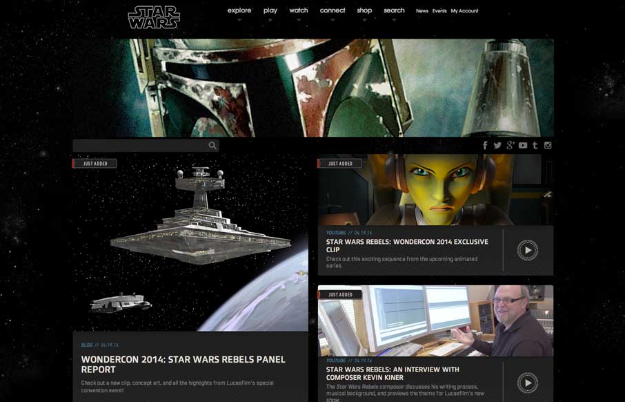
New responsive Star Wars website. Really, over the years this website hasn’t been the best looking. I really dig this simpler approach that just puts the imagery and content out there and doesn’t try to be too tricky or pretty just with extraneous...
