
by Gene Crawford | Apr 7, 2014 | Design Firm, Gallery
I really like this new pattern that’s emerging where the main nav changes slightly once you move past the initial page load. I do also dig the interactions placed with each of the main images on the home page too, very smart use of animations.
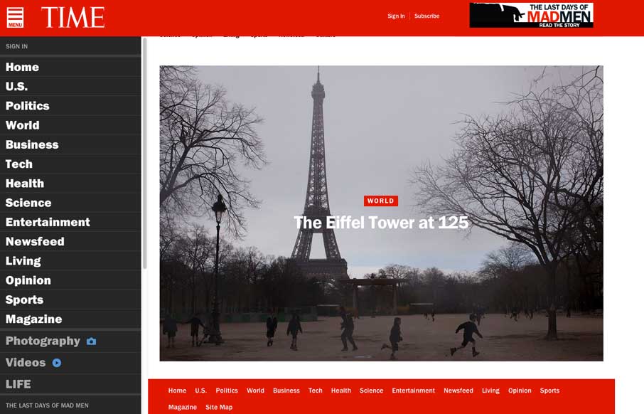
by Gene Crawford | Apr 4, 2014 | Gallery
Really great transition to a responsive website from Time Magazine. It’s really beautifully done. There are also sections like this World Trade Center article that show they are really trying to push the boundaries of online writing. Well done.
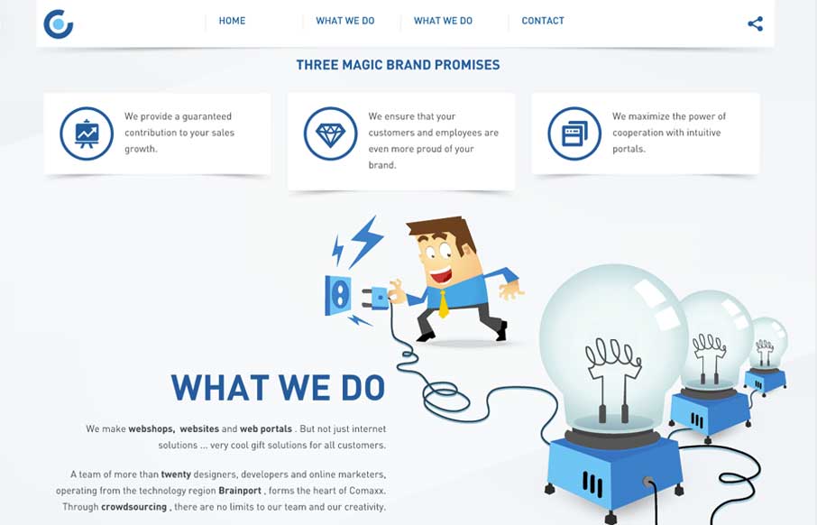
by Aaron Griswold | Apr 4, 2014 | Design Firm, Gallery
I like this nav design. It’s a different idea to include, pretty much, a sitemap as your main nav if you can (if the site is small enough). I also dig how the illustrations are used and interact visually with the copy.
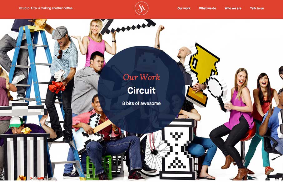
by Aaron Griswold | Apr 3, 2014 | Design Firm, Gallery
Pretty slick movement on the site as you scroll. I like the way the colors flip around too on interaction with the main nav. Clever stuff here.
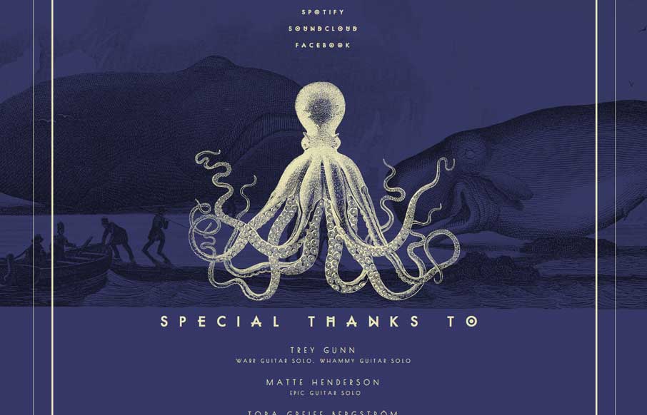
by Aaron Griswold | Apr 3, 2014 | Gallery, Music
Really beautiful single page site for this band. I luurve the illustrations.

by Aaron Griswold | Apr 3, 2014 | Gallery
Pretty nifty site design. I like how the main nav stays fixed but in the box shape that overlays the site. Also, resize this badboy, that’s a cool way to hide the transitions but also making it interesting for us that build sites too. Bravo.