by Gene Crawford | May 22, 2025 | Design Firm, Gallery
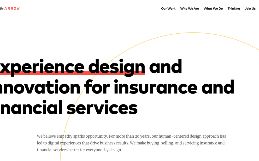
Designers who put people first, for industries that need it most. We are customer experience innovators, helping our clients build digital products and services that allow them to form authentic, meaningful bonds with the people they serve. We are generous design...

by Gene Crawford | May 21, 2025 | Design Firm, Gallery
OHO helps ambitious, forward-looking marketers maximize their investments in digital to elevate their organization’s prestige and recruit the customers they need.

by Gene Crawford | May 20, 2025 | Design Firm, Gallery
We’re Plank, a B Corp Certified web design and development agency based out of Montreal. We specialize in building websites for Arts & Culture and mission-driven organizations, but we also love collaborating on projects with values that align with our own. Read on...

by Gene Crawford | May 19, 2025 | Design Firm, Gallery
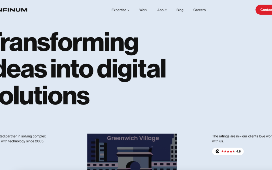
We are a team of product-focused designers, engineers, product managers, and project managers that can help you design and build software with the lean, agile, delivery-minded processes that startups use (even if you aren’t one). With decades of startup experience on...

by Gene Crawford | May 16, 2025 | Design Firm, Gallery
I really like the navigation interactions on this website. The rest is very well engineered and designed as well. Worth your time with some study for sure.

by Gene Crawford | May 15, 2025 | Design Firm, Gallery
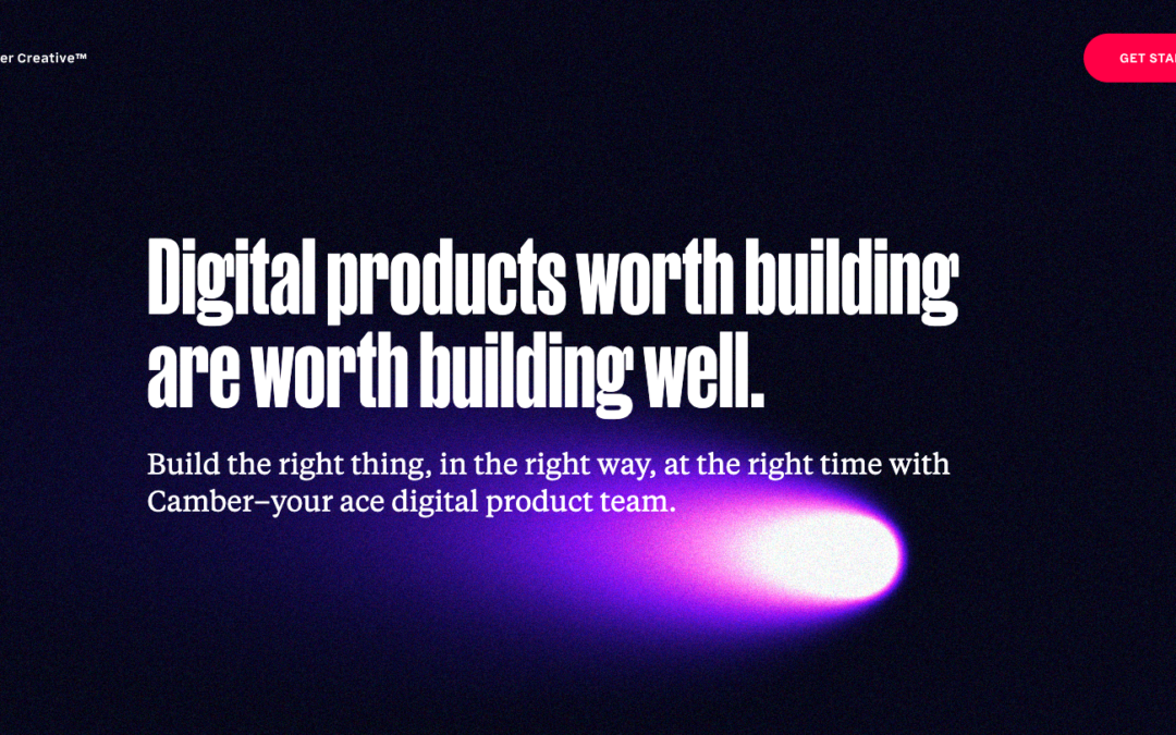
Nifty mouse-interaction tool-tip thing. I dig the comet like animation. Then the shapes and vibe of the rest of the page is very inviting and soft. I dig it.
