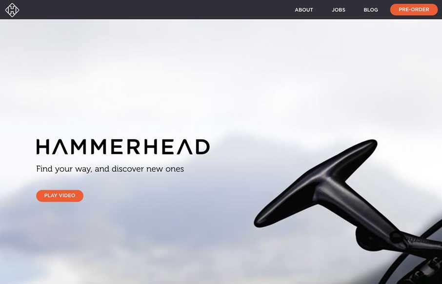
by Gene Crawford | Jun 2, 2014 | Gallery
I love narrative in a site design. This site is such a good narrative experience to scroll through. Well done.
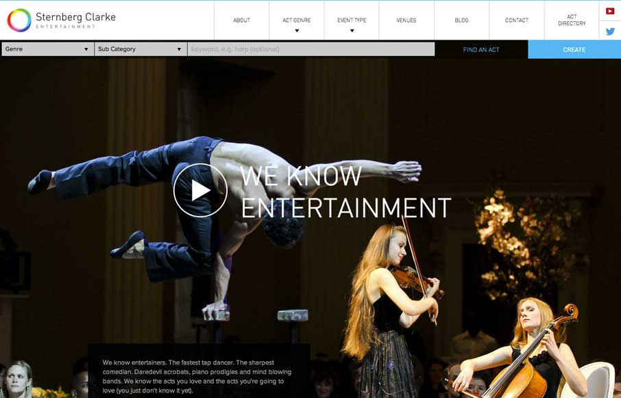
by Gene Crawford | Jun 2, 2014 | Gallery
Well. The new responsive site for entertainment company @SternbergClarke is rather striking: http://t.co/WwJ2RMiAFc (via @leejamescasey) — Responsive Design (@RWD) May 7, 2014 One of the better fixed nav transforms i’ve seen. A quite nice layout as well...
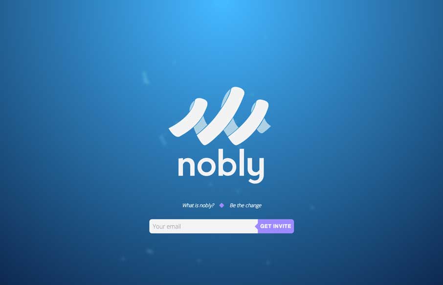
by Gene Crawford | Jun 2, 2014 | Gallery
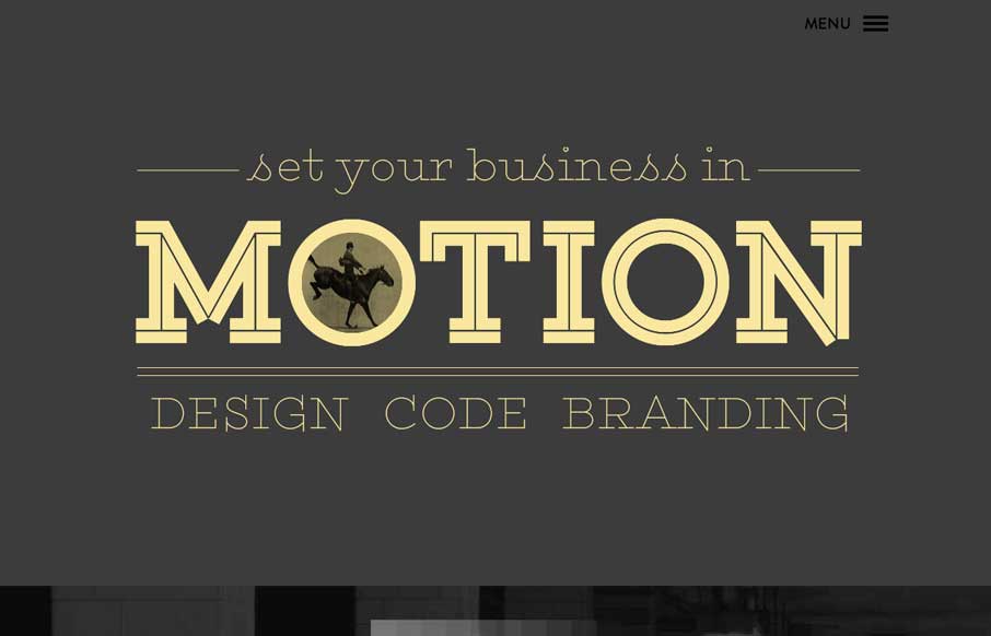
We don’t normally post splash pages or coming soon pages, but in this case. Dang, it’s a neat one.
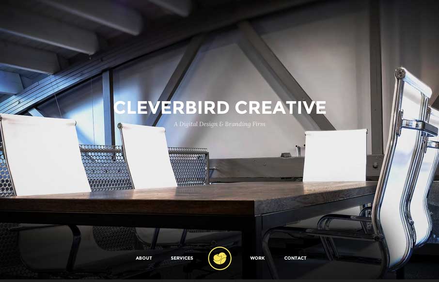
by Gene Crawford | May 30, 2014 | Design Firm, Gallery
Really great transitions from space to space on the page make the Clever Bird Creative memorable for me. Also the use of slight transparent blocks of space also catches my attention. Beautiful stuff.
by Gene Crawford | May 30, 2014 | Gallery
Cool, almost subtle use of animations to draw your eye on the page. I like the slide out nav (not the hamburger icon use 🙂 but how they’ve used the big graphic blocks as marquee elements in the nav itself. Clever.
by Gene Crawford | May 30, 2014 | Gallery, Travel
Nice layout here. I really like the detail work in how the page simplifies when you scale the browser down for the various screen sizes. Smart stuff. Also the detail in the search box ux. Check it out.