
by Gene Crawford | Sep 29, 2014 | Gallery, Music
New design for Rdio. Brilliant stuff. I really like the layout and how it uses the static images in the background and an almost parallax effect as you scroll down the page. The little interaction ‘device’ in the top right corner that lest you sort through...
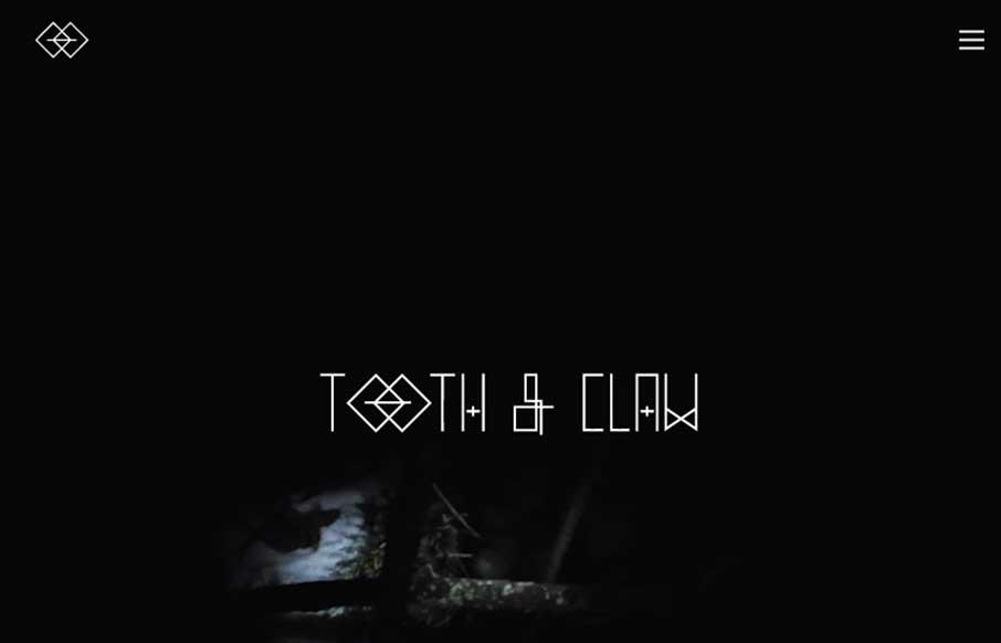
by Gene Crawford | Sep 26, 2014 | Gallery
Very ‘story telling’ centric design with Tooth & Claw. I like this aspect of it, keeping you focused on this aspect seems important for these guys. Some of the nav elements are a little hard to see and get to, but in the end i’m not so sure...
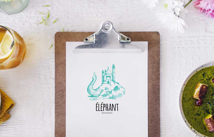
by Gene Crawford | Sep 26, 2014 | Food and Beverage, Gallery
Some nice little details and inviting design make this site for Éléphant a really great restaurant website. Submitted by: Pier-Luc Cossette Role: Designer & Developer Éléphant is a indian food restaurant situated in Québec, Canada.
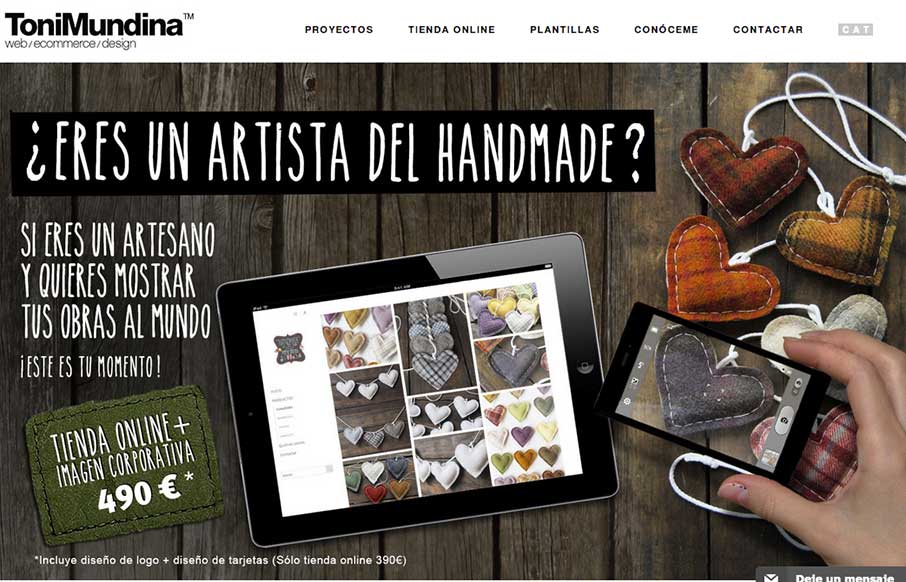
by Gene Crawford | Sep 26, 2014 | Gallery, Portfolio
It’s a standard clean style layout that has good responsive adaptations applied to the design. What I like most is the work put into the imagery, it takes time to get stuff like that to show off in a way that’s compelling. Submitted by: Toni Mundina Role:...
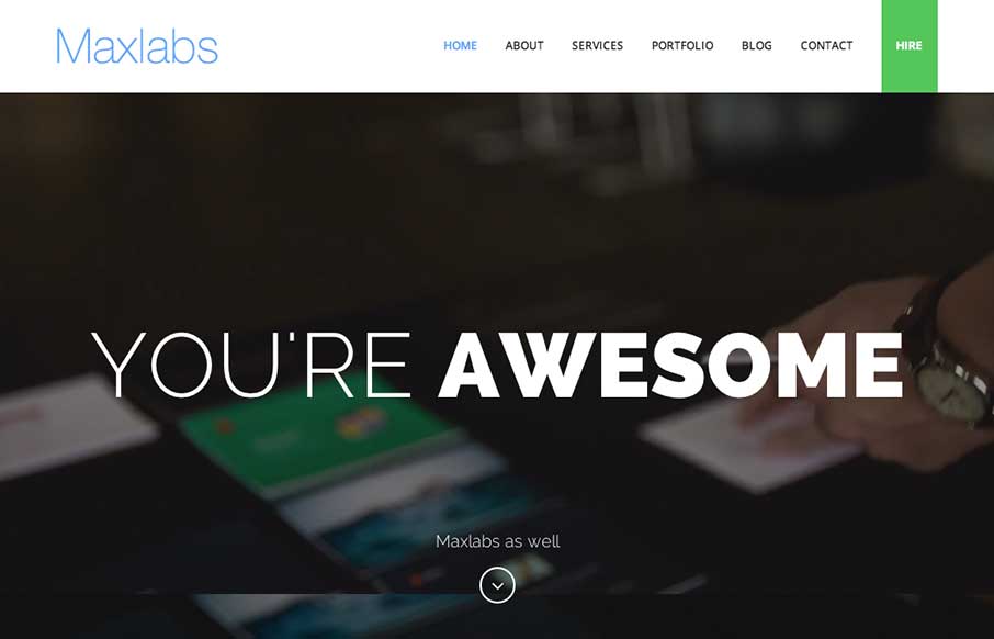
by Gene Crawford | Sep 25, 2014 | Gallery
Kind of standard fair for content on the Maxlabs website, but the slight differentiation in the way each section is treated makes it stand out to me. I like the subtle changes in layout as you scroll and the ‘just enough’ interaction to pull you in a bit...
by Gene Crawford | Sep 25, 2014 | Gallery
Nice easy way to deliver a message. I can’t help but reminisce about splash pages when I see site’s that utilize big entry overlay designs like this. Submitted by: Gareth Evans @webfireagency Role: Project Manager We’ve tried to do something...