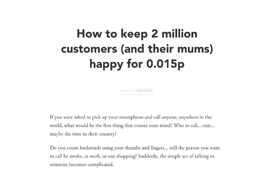
by Gene Crawford | Jul 29, 2015 | Blog, Gallery
Pretty neat experience with the Umahu website. It has a very simple straightforward purpose, which is to tell a single story. This is probably the best design project you could get, since most website projects need to do about 12 things at one time to 12 different...
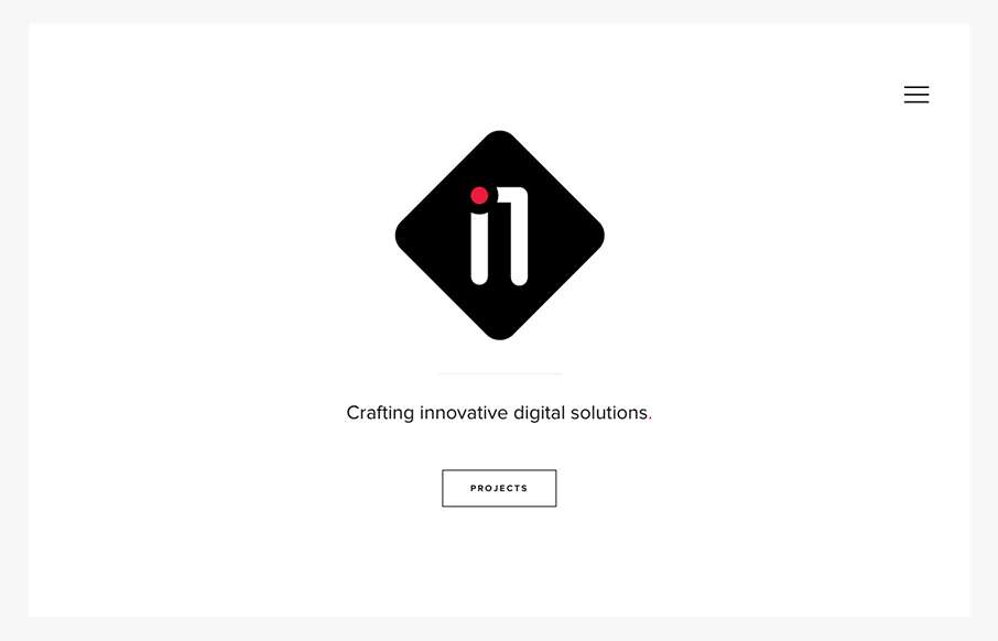
by Gene Crawford | Jul 28, 2015 | Gallery
Very nice minimal approach. I’d say it’s “minimal” done right. I love that there’s a singular focus on that “projects” button, then you can explore from there, but that’s the main thing. It’s very clean and clear...

by Gene Crawford | Jul 28, 2015 | Gallery
A fairly clean experience for a big credit card website. The Chase site is responsive and has some nice open space throughout that really helps with the large amount of “stuff” they’ve put on the screen. I like the navigation design, using the...
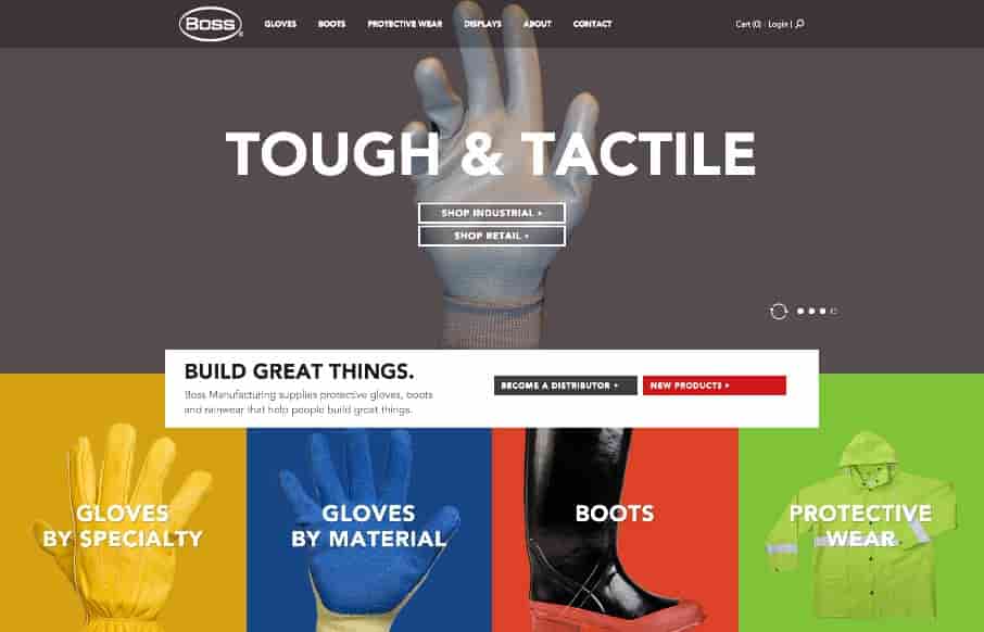
by Aaron Griswold | Jul 28, 2015 | Gallery, Product, Shopping
That is some crazy stuff coming from Boss Gloves – making the site exciting for products that aren’t (their words below – not mine). Like the interaction on the slider – and like the points they make below – pretty spot on. From the...
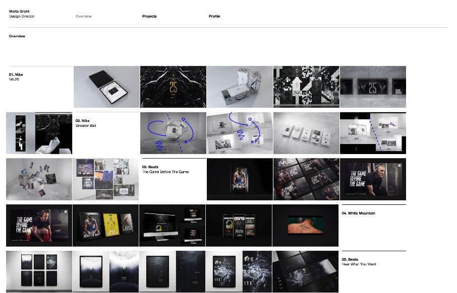
by Aaron Griswold | Jul 27, 2015 | Gallery, Portfolio
I think Malte Gruhl out of London, has worked on every ad campaign as a design director ever created – at least it feels like that in his portfolio site. It’s some sweet work encapsulated in good minimalist design. The images seem lower-res so that you can...

by Aaron Griswold | Jul 27, 2015 | Gallery, Shopping
If you’re going to rebuild Amazon – might as well do it cleanly and organized – Jet seems to do that. Like the flat design / icons coupled with real products – interesting combo. Reminds me a little of the iPod ads ala way-back in 2003.