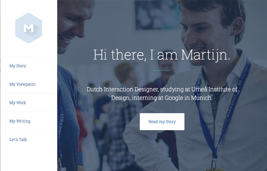
by Gene Crawford | Apr 27, 2016 | Gallery
UX Design intern at Google. Pretty solid work here. I love the overall simple and clean approach, but I love the little interaction when you scale the window down the most. Clever and nice touch for sure. Hire this dude!
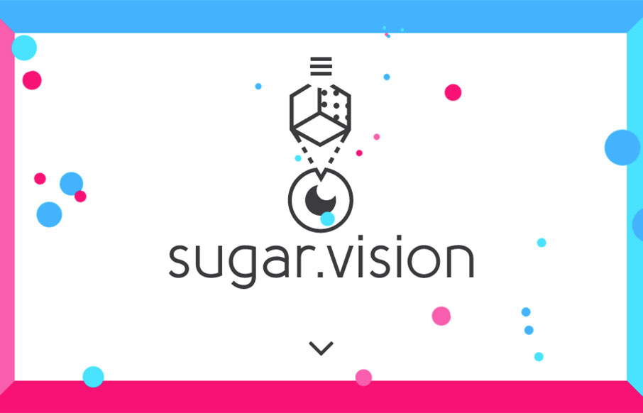
by Gene Crawford | Apr 27, 2016 | Gallery
Badass looking design for Sugar Vision. I love all the things! It has solid design and layout and execution and also heart. I love the vibe and design approach, so much cool. From the Designer: Sugar Vision is a dedicated team of experienced creatives working on...
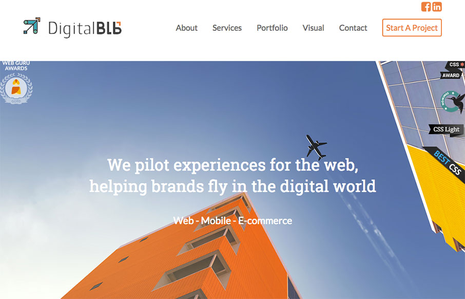
by Gene Crawford | Apr 26, 2016 | Gallery
Pretty solid design work here. I really dig the way the logo slides over the word mark as you scroll down. The remainder of the home page layout is well done, with the different sections giving it a good rhythm and corporate vibe. From the Designer: As a digital...
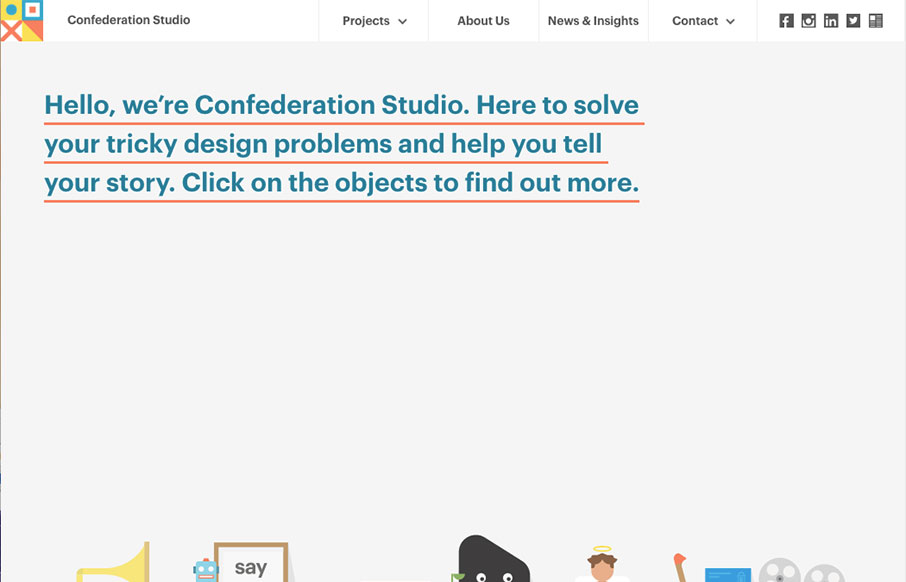
by Gene Crawford | Apr 26, 2016 | Gallery
Luuurrrvvvee the simple layout approach to Confederation Studio, the thing that lands it in the cool zone is the illustration work. Really, they’re great. I love how it goes from a big hero image area to colorful blocky sections. The rhythm is strong and the...
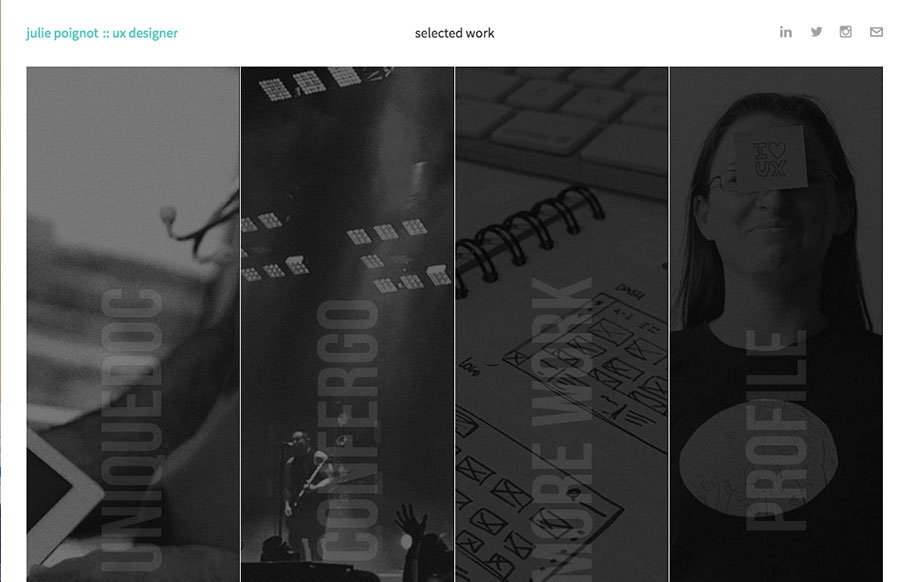
by Gene Crawford | Apr 26, 2016 | Gallery
Pretty unique layout and design for Julie Poignot’s site. I love this thing. It’s intriguing at first glance as well as deeply enriched by animation and content. The case studies for example are amazing rich and well done. Check this site out when you get...
by Gene Crawford | Apr 25, 2016 | Gallery
Pretty standard fare from a layout perspective but what i’d like to point out is the animation load for the timeline. That’s pretty rad, I think it kind of makes the site for me. Good stuff.