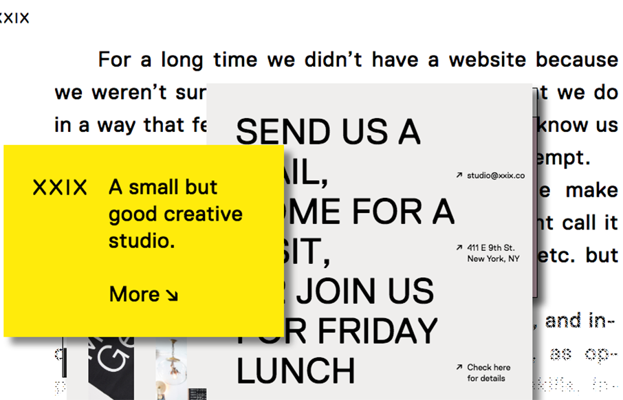
by Gene Crawford | Jun 9, 2016 | Gallery
A good way to show you’re a “new” type of interactive firm is to show it off in your work. Twenty Nine NYC doest that well here with their website. It’s not the most highly functioning site in terms of pure usability but it’s not that bad...
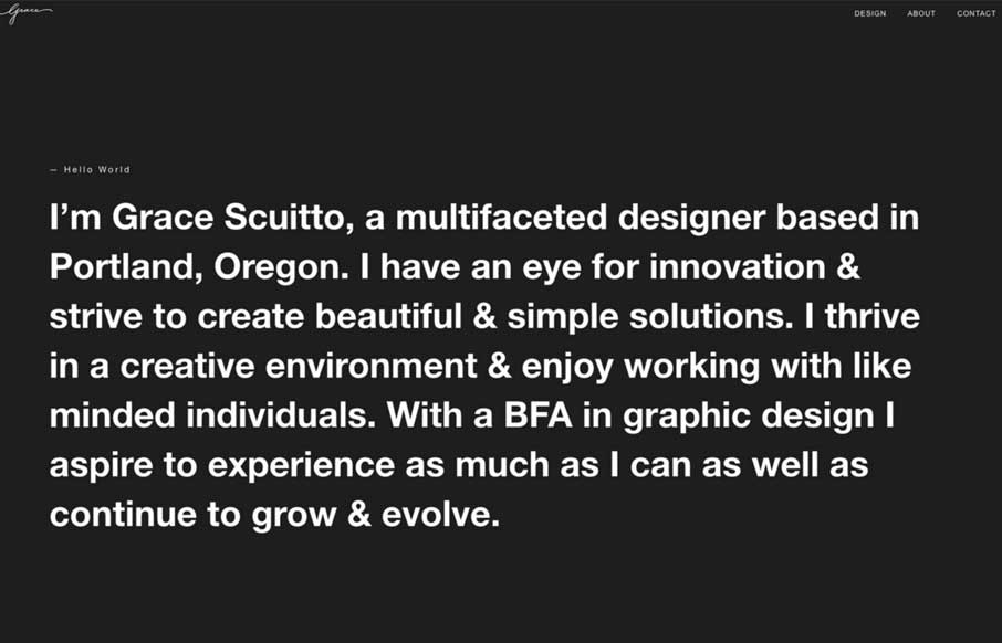
by Gene Crawford | Jun 9, 2016 | Gallery, Portfolio
I love the large block of copy on that dark background and then *BANG* you get some animated work samples loaded up on you. Good stuff. That slow color change on the background is nice too, it changes the entire experience in just that little shift.
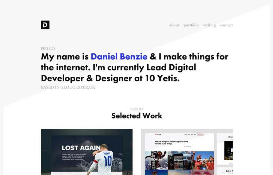
by Gene Crawford | Jun 9, 2016 | Gallery, Portfolio
Simple layout and nice typography. The Daniel Benzie portfolio site is quite nice. The angle in the background image really helps drive your eyes down into and through that main tagline then on to the work.
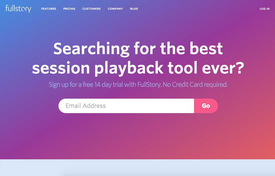
by Gene Crawford | Jun 8, 2016 | Gallery
Post written by John Williams: This is one of my first projects since starting at FullStory in April. I joined the team because FullStory is such an unbelievably cool piece of tech. We wanted to make a landing page that would really hammer the core of what makes us...
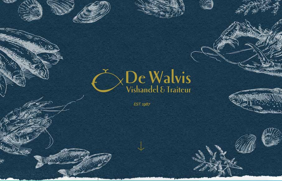
by Gene Crawford | Jun 8, 2016 | Food and Beverage, Gallery
Very cool site design for an older well established brick and mortar business. I dig that it’s fairly standardized as far as basic layout and navigation go but it’s just got some beautiful colors, imagery and details. Good work! We made this website for a...
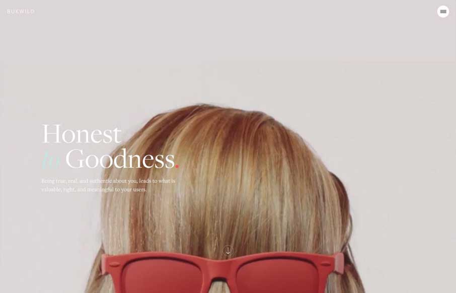
by Gene Crawford | Jun 8, 2016 | Design Firm, Gallery
Pretty great visual vibe here. I love the rhythm the page gives you as you scroll down, you feel like you’re getting the vibe of the company. I love the detail work, it’s straight up and simple, but really layout focused detail work. Bravo.