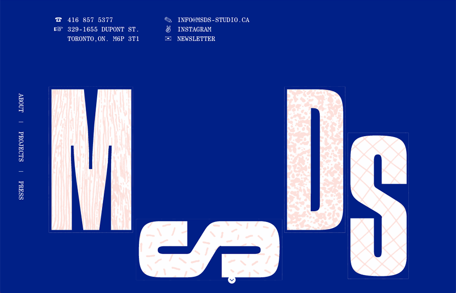
by Gene Crawford | Jun 22, 2016 | Design Firm, Gallery
Pretty cool, non-standard typography here. Mix that in with that neat thing they’re doing on the site, where when you scroll down and back up it changes the site considerably. Pretty cool and unique work.
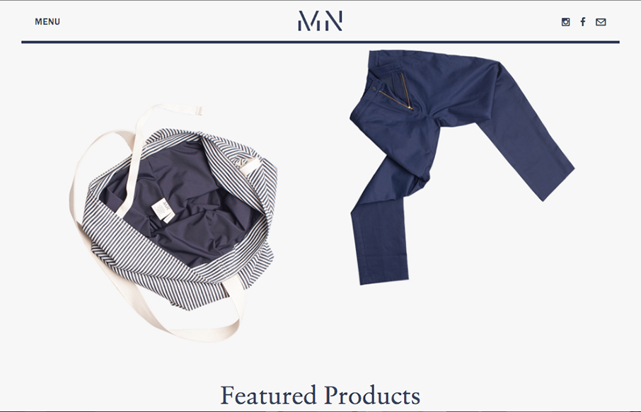
by Gene Crawford | Jun 22, 2016 | Fashion, Gallery
Pretty cool angle on some now-standard design patterns. I love how the header has that line and everything perfectly scroll-folds up into it. Then the menu is cool, all the lines and blockiness of it make it feel really fresh to me.
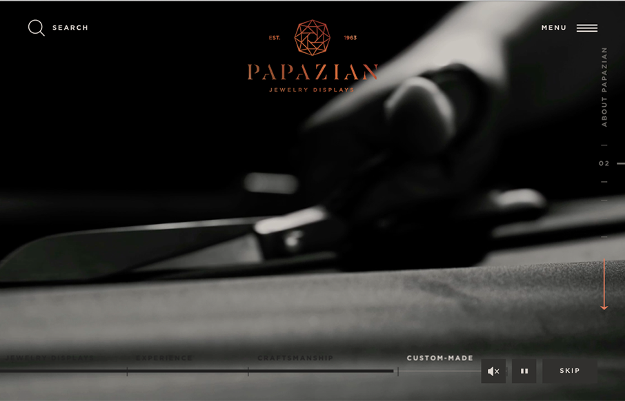
by Gene Crawford | Jun 22, 2016 | Gallery, Product
Beautifully done website. I love the subtle and fragile looking lines and the way the photography supports it. The News & Updates section of the layout on the home page is wonderful as you get down to it. Really nice website here.
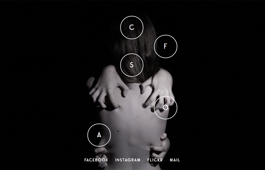
by Matthew Teague | Jun 21, 2016 | Gallery, Portfolio
Love this photo portfolio site for Jolien Roos out of Belgium – looks to by @studiosiebe. Very unique intro/navigation, five circles that turn into your “hamburger” as you move through the site. For photography sites – the images sell it...
by Aaron Griswold | Jun 21, 2016 | Gallery, Product
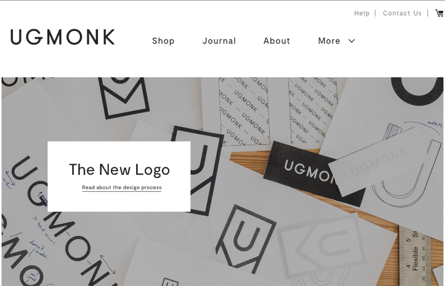
So our friend Jeff Sheldon at Ugmonk has a new site and logo. (Jeff spoke a ConvergeSE a couple of years ago) Very cool to read where the changes in business and design come from as your company grows, and grows up. Great article here from Jeff about all of it....

by Matthew Teague | Jun 21, 2016 | Gallery, Product
This website has a nice clean layout that displays its product quite well while replicating the design of the phone into the layout of the site.