by Gene Crawford | Jul 20, 2016 | Gallery
Really beautiful and simple site for a really beautiful and simple idea. I dig this idea and I dig the design approach to the website. Show’s you how the app looks and works in context in a website layout that’s easy to scroll and take in. Good work.
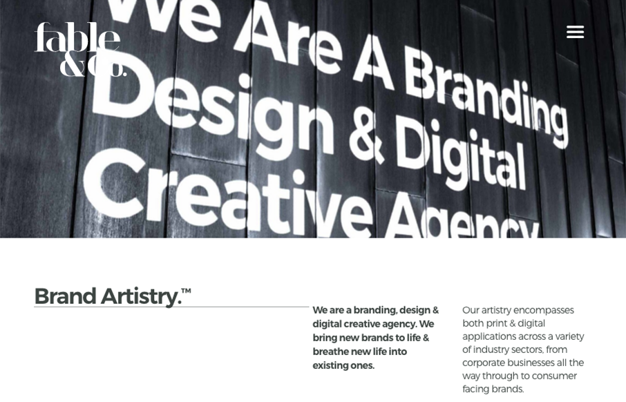
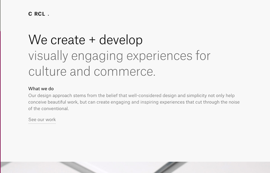
by Gene Crawford | Jul 20, 2016 | Design Firm, Gallery
The first thing I see when I check this site out is the use of typography within the imagery. Very cool. I also love the use of color being minimal and only on instances where work is being shown off. Good stuff, subtle design. Bravo.
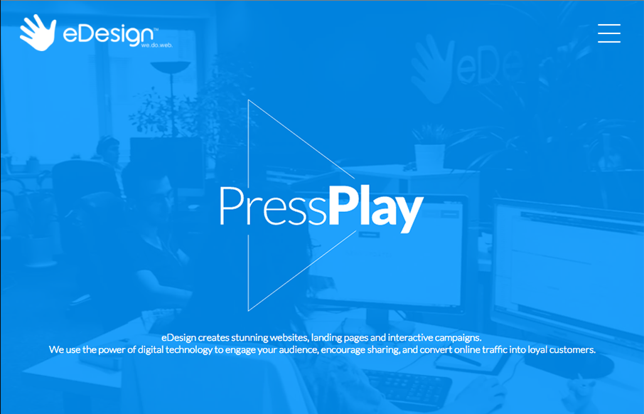
by Gene Crawford | Jul 19, 2016 | Design Firm, Gallery
Really strong visuals and movement. Just enough and just tight enough to make you take a second gander. I dig the menu design/interaction too. Solid work through and through.
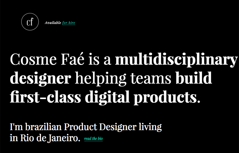
by Gene Crawford | Jul 19, 2016 | Design Firm, Gallery
I like the dark background used here, the typography in the top portion of the page is solid too. Haven’t seen that in a bit, that mixed withe the asymmetrical intro of all the images makes for a cool vibe. Thorough case study pages give you plenty of great...

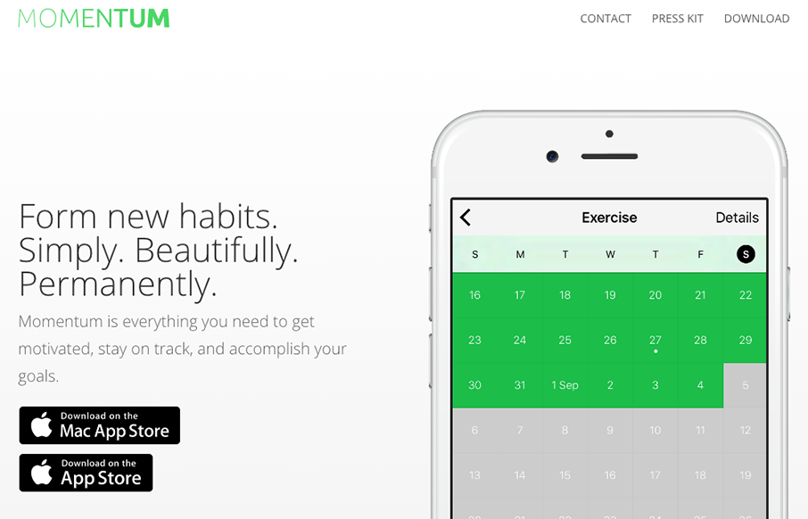
by Gene Crawford | Jul 19, 2016 | Gallery
I really like the use of the product imagery and the typography. Super cool look and feel. There’s a good bit going on visually here, including the changes to the design as you scale down the window to fit smaller screens. Solid work here. From the Designer:...
by Gene Crawford | Jul 18, 2016 | Design Firm, Gallery
Cool interaction as you scroll the page. The way it moves from top to bottom is fresh. I also like the offset copy placement. Good looking design here.