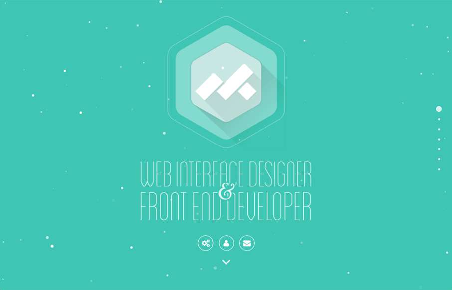
by Gene Crawford | Aug 9, 2016 | Gallery, Portfolio
Pretty fun website design. I dig the animation on the hero area then the design of the portfolio section is unique too. I dig it! From the Designer: Myk is a remote freelance WordPress front-end developer based in the Philippines. Submitted by: Myk Tongco Twitter:...
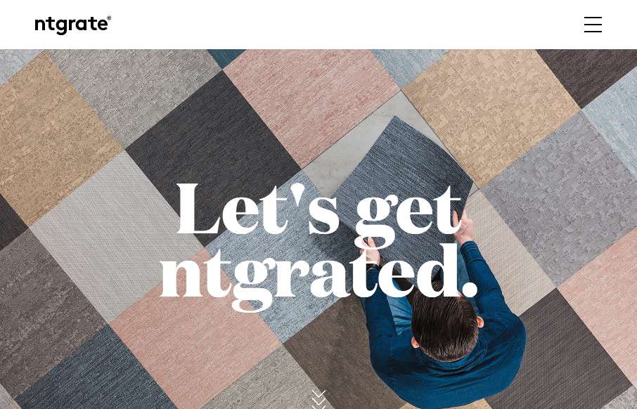
by Gene Crawford | Aug 9, 2016 | Design Firm, Gallery
I really dig that navigation design and UX. Pretty slick. The scroll design is pretty rad too. I like this site most because it really feels different when i’m scrolling and interacting with it.
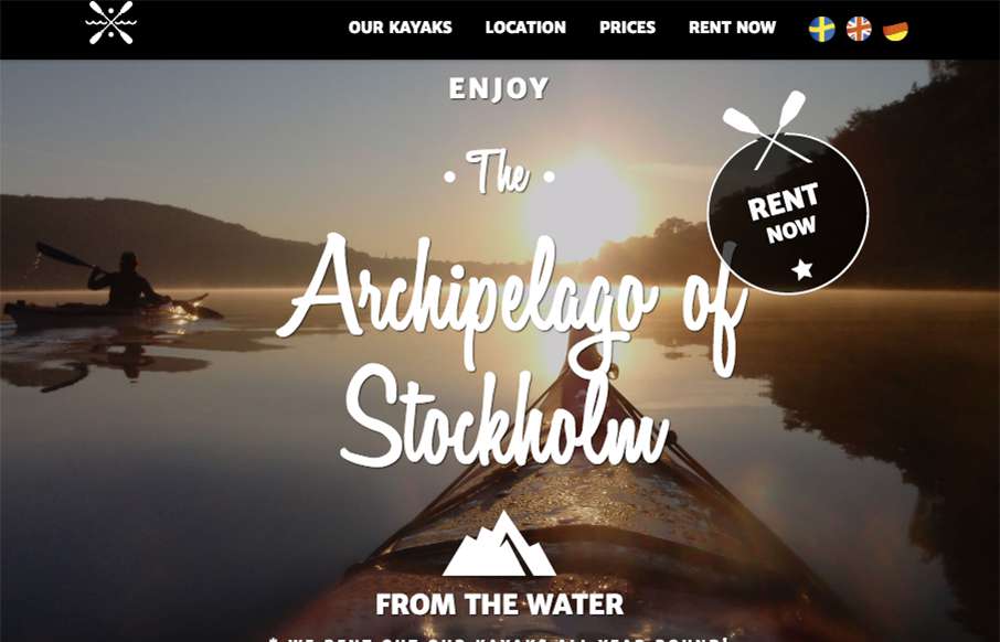
by Gene Crawford | Aug 8, 2016 | Gallery, Travel
I’m a pretty big Kayaking trip fan. I always try to do it when I travel to different areas that permit it. This site isn’t super special but there’s some solid graphic design work and photography happening here that really makes the website work...
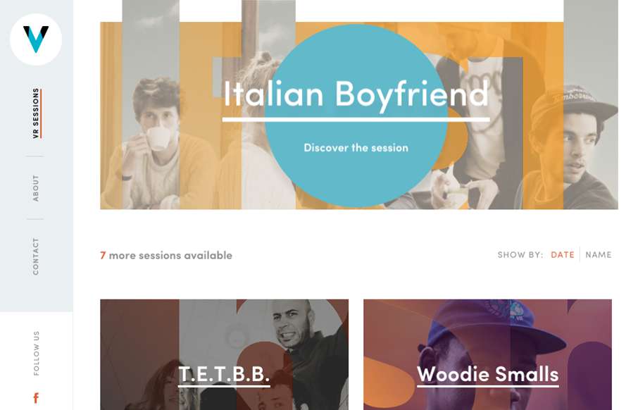
by Gene Crawford | Aug 8, 2016 | Gallery, Music
Pretty slick website design. It’s largely mobile first and indeed I like the mobile to ipad screen size designs best. The “side bar” vertical navigation is unique, though I question it’s usability, I’m not entirely sure it matters much...
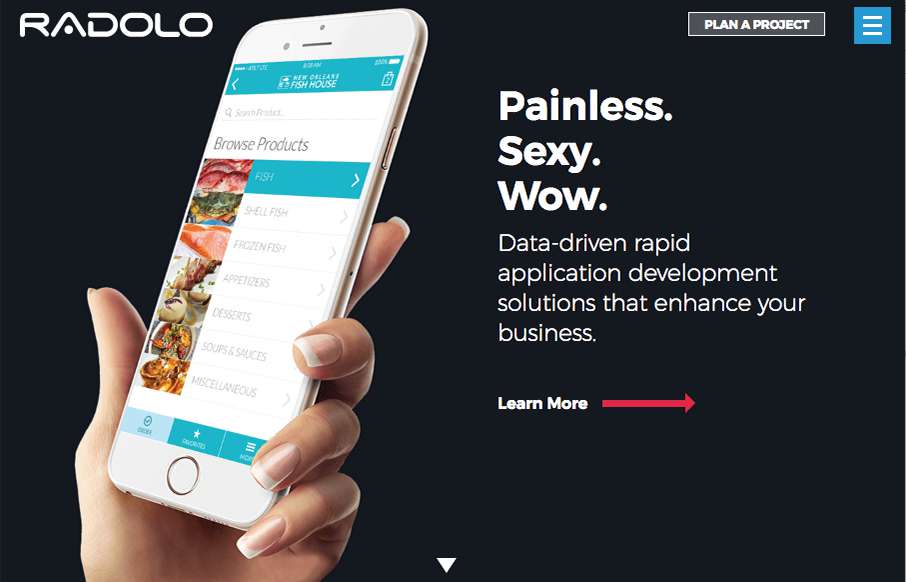
by Gene Crawford | Aug 8, 2016 | Gallery
Pretty cool site design. I dig the bold graphic approach and the muted color palette. The project planner is cool as well as the fly-out menu design. Good work. From the Designer: In the newest iteration of the Radolo website we wanted to create a clean minimalist...
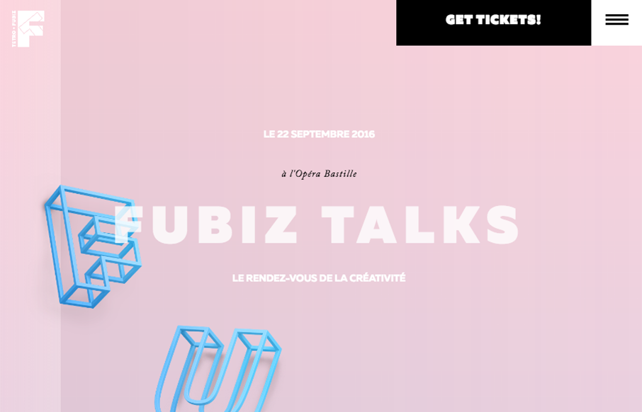
by Gene Crawford | Aug 5, 2016 | Gallery
Badass event website. I love the way they’re utilizing the parallax thing with the floating image elements. Then the timed/triggered stuff is top-notch.