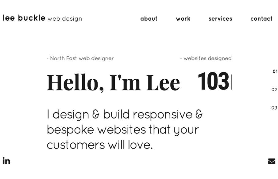
by Gene Crawford | Aug 17, 2016 | Gallery, Portfolio
Such a smart site design for Lee Buckle’s portfolio. I dig the way the navigation works, simple links and then as you scroll you get the “more” hamburger thing. Simply smart. I also really like the overall break down of info into the 3 main sections...
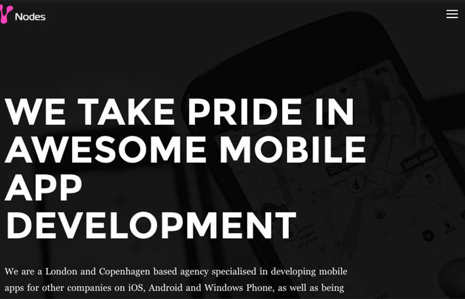
by Gene Crawford | Aug 17, 2016 | Gallery
Pretty cool “straight up” looking design for Nodes Agency. I like the rigid blockiness to it with the dark vibe and professional looking work images. Strong look. From the Designer: We’ve developed this one-page inspired website with WordPress,...
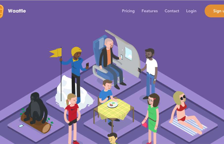
by Gene Crawford | Aug 17, 2016 | Gallery
Really fun looking website for Waaffle. It takes it’s name not at all too seriously which is great and delivers fun illustrations that help tell the story of what the thing does. I like the timed scrolling imagery and the overall brand/vibe a great deal on...
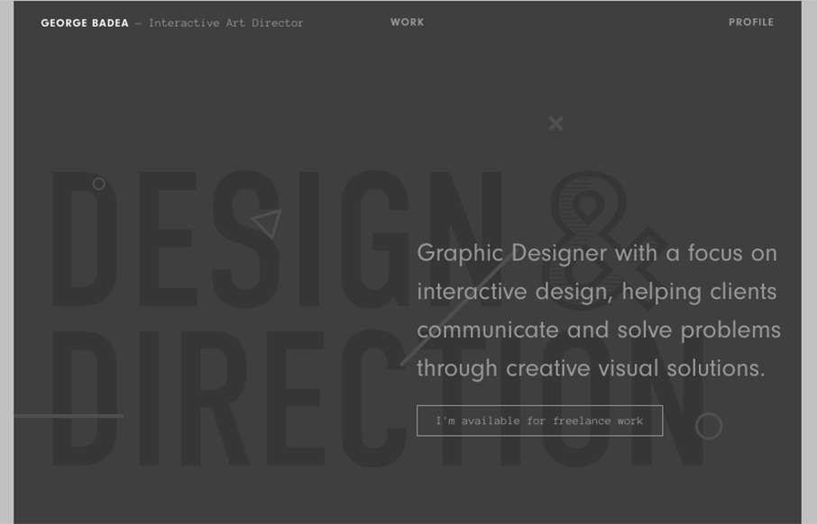
by Gene Crawford | Aug 16, 2016 | Gallery, Portfolio
“Graphic Designer with a focus on interactive design, helping clients communicate and solve problems through creative visual solutions.” It’s not often I see a website design for a designer/portfolio that truly does/believes in their own tagline....
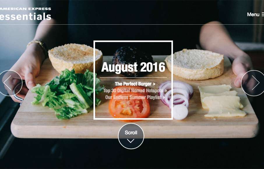
by Gene Crawford | Aug 16, 2016 | Gallery, Marketing
Pretty nifty, big commercial, project. I dig the details worked into the design/interactions and the overall way it’s presented visually. Cool looking project. American Express Essentials is the definitive digital compendium of the best and brightest new ideas....

by Gene Crawford | Aug 16, 2016 | Gallery, Portfolio
Pretty rad idea to put the work first! Seriously, i’m surprised every day by how that’s not the first priority on most designer’s websites. Sell your work first, right?