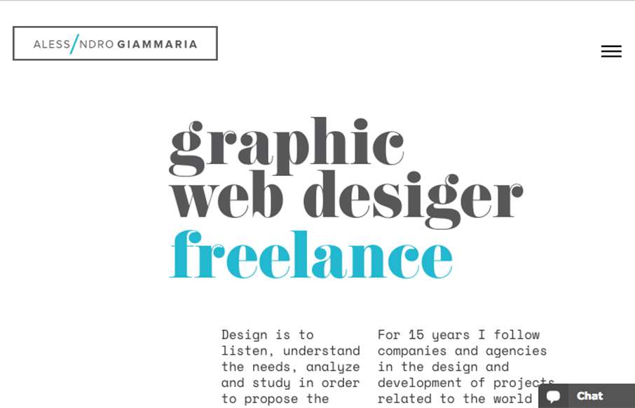
by Gene Crawford | Sep 9, 2016 | Gallery, Portfolio
I really like the openness of the website here for Alessandro Giammaria. It has a nice vertical rhythm and mostly minimal approach overall. ubmitted by: Alessandro Giammaria Twitter: @agiammaria Role: Designer & Developer Country:...

by Gene Crawford | Sep 8, 2016 | Gallery
Man, I really dig this site design for nclud. I like the vibe and all the over states on the nav items here and there. Super rad color palette too. Solid work! Submitted by: Kerry Gunther Twitter: @nclud Role: Designer & Developer Country:...
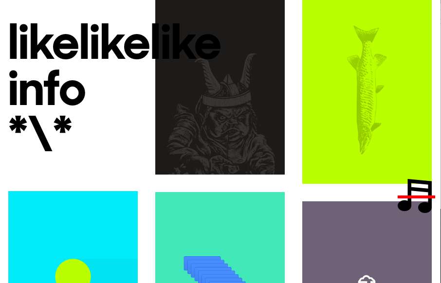
by Gene Crawford | Sep 8, 2016 | Gallery, Portfolio
Super rad layout and interactions here on likelikelike. It doesn’t “feel” like other websites i’ve visited, but man it’s super simple in it’s execution. I love that the most about it. Simple, fundamental, smart.
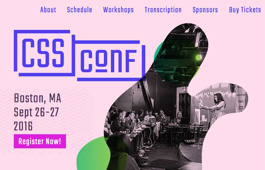
by Gene Crawford | Sep 8, 2016 | Gallery
Really smart looking site for the 2016 CSS Conf website. I love the shapes and how they layer as you scale the browser down. Something for us Frontenders to dig on. Overall straight forward layout too, dig it in a big way.
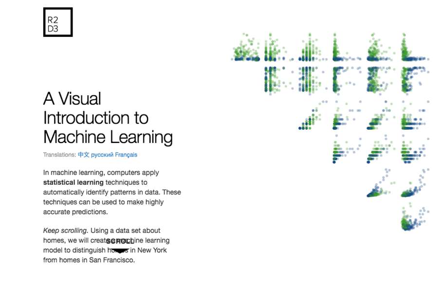
by Gene Crawford | Sep 7, 2016 | Gallery
Pretty great example of scroll-jacking gone right. Give it a spin and see what you think?

by Gene Crawford | Sep 7, 2016 | Gallery, Portfolio
Pretty fun personal/portfolio site for Michael Ngo. I really love the video loop and then the feet at the bottom. 🙂 Pretty sweet graphic design flourishes too.