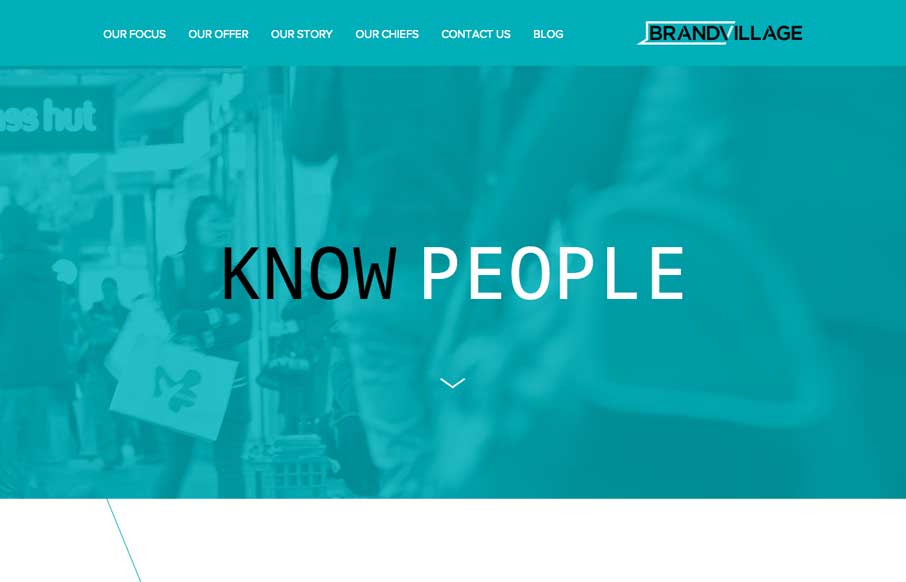
by Gene Crawford | Apr 25, 2014 | Gallery, Marketing Company
I know a lot of what makes up this site is trendy but I like it when someone takes something that’s used a lot and changes it up a bit. Like with the angular cuts to show the imagery as you scroll down, that’s a nice effect. Especially for those of us that...
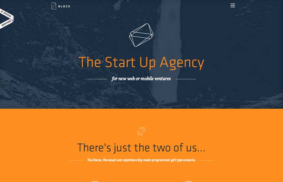
by Gene Crawford | Apr 24, 2014 | Gallery, Marketing Company
Cleverly designed illustrations/animations as you make your way down the page. I like the little detail in how the main nav works with the hamburger icon vs. how the nav items load.

by Gene Crawford | Apr 23, 2014 | Gallery, Marketing Company
Really nice illustration work. It truly keeps me wanting to dig around more through the site’s content. I also like the little interaction animation stuff like when you resize the browser window and the main nav bar’s movement when you start...
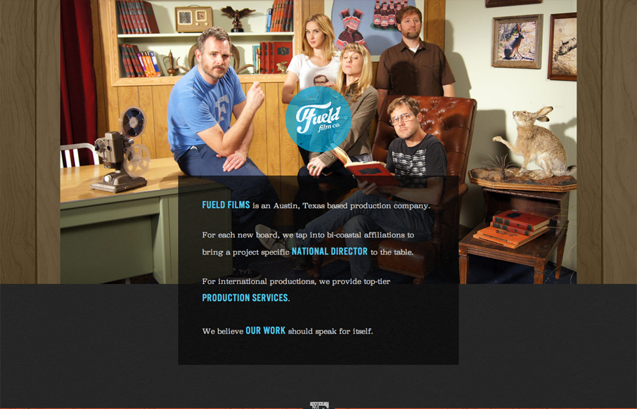
by Giovanni DiFeterici | Aug 23, 2012 | Gallery, Marketing Company
Submitted by: David Guillory @builtbysource Role: Designer & Developer Fueled films has an amazingly bright feel for such a dark design. I like the theatrical photography and understated humor. I can tell that these people are in the business of entertainment....
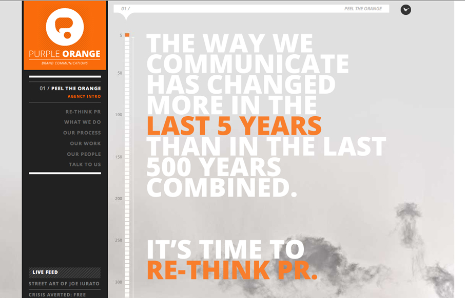
by Gene Crawford | Aug 21, 2012 | Design Firm, Gallery, Marketing Company
Submitted by: Emily Hopcian We set out to make a new and distinctive brand identity for ourselves (Purple Orange is a brand communications agency) and settled on this one-page design utilizing parallax to create a more dynamic look and feel. We tapped two agencies to...
by Giovanni DiFeterici | Aug 20, 2012 | Design Firm, Gallery, Marketing Company
Submitted by: Steve Craw @AguruStudio Role: Designer I’m often against splash screens, but the one presented by agurustudio is really helpful and definitely improves the experience. The simple animation is easy to understand and introduces visitors to a behavior...